

This notebook has three parts. First matplotlib, building a figure piece by piece: the figure/axes model, every core plot type, how to style and annotate one, and a checklist to run a figure through before it goes on a slide. Then cartopy, putting a map on the page — not just one projection, but a choice of them, each suited to a different question. Last, xarray, which wraps arrays in named dimensions, coordinates, and metadata so that operations read in the language of the data. One running dataset threads through all three parts — a year of daily 2 m air temperature on a small latitude–longitude grid — and the notebook closes with a generated-code plotting bug that silently flips a map upside down.

Figure 1:The matplotlib logo, from the project’s own gallery of logo variants.
1.4.1 The Figure and Axes Model
The figure is the highest level of organization in matplotlib: the sheet of paper. An axes is one plot on that sheet, with its own x- and y-axis, and everything is drawn into an axes, never into the figure directly. Understanding that split is what makes the rest of the library predictable, so build a figure by hand once before switching to the shorthand used everywhere else.
%matplotlib inline
import numpy as np
import matplotlib.pyplot as plt
fig = plt.figure() # a figure with no axes in it: nothing is drawn
fig = plt.figure(figsize=(13, 5)) # figsize is (width, height) in inches
plt.show()<Figure size 640x480 with 0 Axes><Figure size 1300x500 with 0 Axes>fig.add_axes([left, bottom, width, height]) places one axes by hand. The four numbers are fractions of the figure, so [0, 0, 1, 1] fills it completely and [0, 0, 0.5, 1] takes the left half.
fig = plt.figure()
ax = fig.add_axes([0, 0, 1, 1])
plt.show()
fig = plt.figure()
ax = fig.add_axes([0, 0, 0.5, 1])
plt.show()
Because each axes is positioned independently, the same call can place a small panel inside or beside a large one — an inset map, or a zoom on part of a series.
fig = plt.figure()
ax1 = fig.add_axes([0, 0, 0.5, 1])
ax2 = fig.add_axes([0.6, 0, 0.3, 0.5], facecolor="green")
plt.show()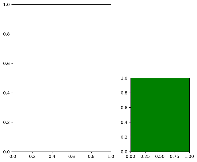
1.4.2 Subplots
Positioning every axes by hand gets tedious as soon as there are more than two. fig.subplots(nrows, ncols) lays out a regular grid and returns the axes as an array, indexed like any other numpy array.
fig = plt.figure()
axes = fig.subplots(nrows=2, ncols=3)
plt.show()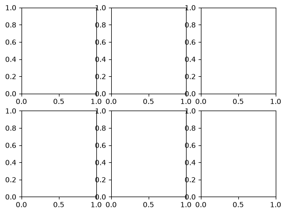
fig = plt.figure(figsize=(12, 6))
axes = fig.subplots(nrows=2, ncols=3)
plt.show()
print(type(axes).__name__, axes.shape)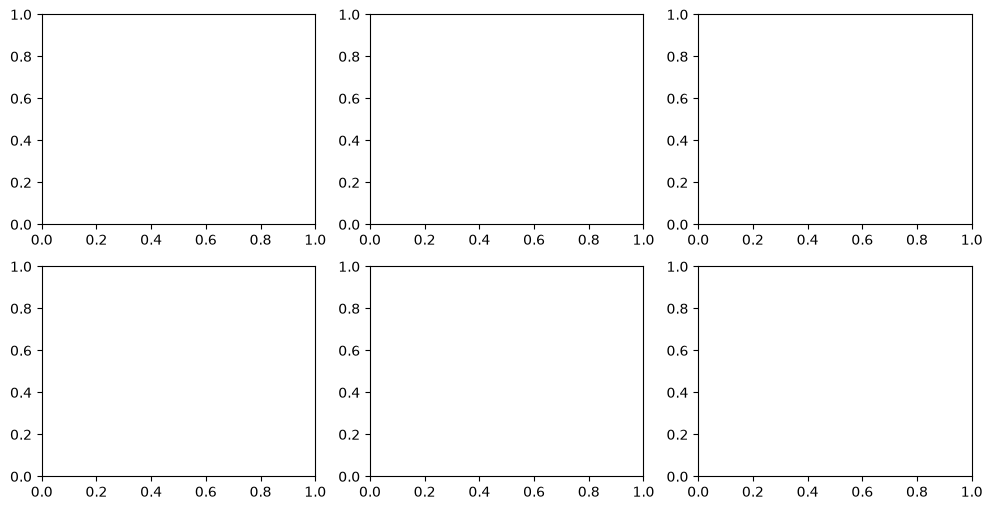
ndarray (2, 3)
There is a shorthand that creates the figure and its axes in one call, and it is the recommended way to start a figure:
fig, ax = plt.subplots()
plt.show()
Keyword arguments to plt.subplots split in two: those for the figure itself (figsize) and those forwarded to every axes it creates, collected in a dictionary under subplot_kw. The same dictionary is what asks for map axes rather than ordinary ones, which is how cartopy plugs into matplotlib.
fig, axes = plt.subplots(ncols=2, figsize=(8, 4), subplot_kw={"facecolor": "lightgray"})
plt.show()
print(axes.shape)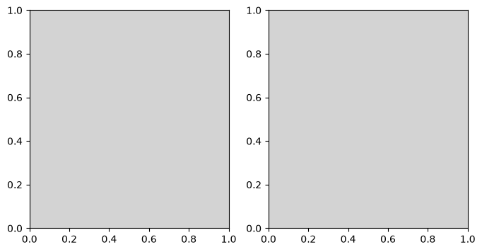
(2,)
1.4.3 Drawing into Axes
Everything below draws into an axes by name: ax.plot(...), ax.set_xlabel(...). This is matplotlib’s object-oriented style, and it is the one to learn. The data for the next few sections is a synthetic year of daily weather at three stations at different elevations, standing in for the kind of record a national weather service publishes.
# a Generator object: an explicit, local random-number source (numpy's current
# best practice), unlike the shared global state behind np.random.random() in 1.3
rng = np.random.default_rng(0)

days = np.arange(366)                                    # day of year, 2024 (a leap year)
seasonal_celsius = -np.cos(2 * np.pi * days / 366) * 10.0

ts_celsius = 5.0 + seasonal_celsius + rng.normal(0, 1.5, size=366)   # valley station
ridge_celsius = ts_celsius - 6.5                                     # ~1000 m higher
mountain_celsius = ts_celsius - 18.0                                 # ~2800 m higher

# relative humidity peaks about a month after the coldest day, so it lags temperature
rh_percent = 70.0 + 12.0 * np.cos(2 * np.pi * (days - 30) / 366) + rng.normal(0, 3.0, size=366)

print(ts_celsius.shape, ts_celsius.min(), ts_celsius.max())
(366,) -8.276103012911829 17.749338483741457
fig, ax = plt.subplots()
ax.plot(days, ts_celsius)
plt.show()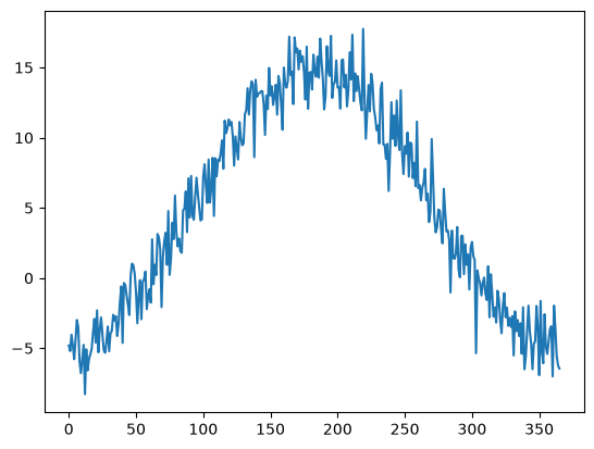
This does the same thing as
plt.plot(days, ts_celsius)
plt.show()
The difference is that plt.plot draws into whichever axes matplotlib currently considers active, and leaves you to keep track of which one that is. With one plot per figure it makes no difference. With two it does:
fig, axes = plt.subplots(figsize=(8, 4), ncols=2)
ax0, ax1 = axes
ax0.plot(days, ts_celsius)
ax1.plot(days, rh_percent)
plt.show()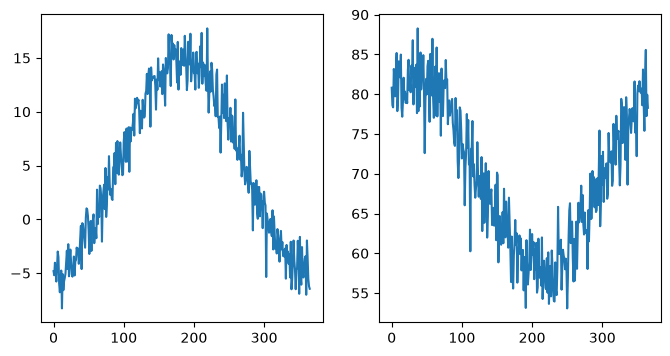
1.4.4 Labeling Plots
Those two panels are unreadable: nothing on them says what is plotted or in what unit. set_xlabel, set_ylabel, and set_title fix that, and plt.tight_layout() re-packs the panels so the new text does not overlap. Every axis in this book carries its physical quantity and its SI unit.
fig, axes = plt.subplots(figsize=(8, 4), ncols=2)
ax0, ax1 = axes

ax0.plot(days, ts_celsius)
ax0.set_xlabel("day of year")
ax0.set_ylabel("temperature (°C)")
ax0.set_title("daily mean air temperature")

ax1.plot(days, rh_percent)
ax1.set_xlabel("day of year")
ax1.set_ylabel("relative humidity (%)")
ax1.set_title("daily mean relative humidity")

# squeeze everything in
plt.tight_layout()
plt.show()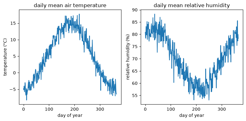
1.4.5 Customizing Line Plots
One call to ax.plot can take several x/y pairs in sequence, and draws each as its own line in the next color of the default cycle.
fig, ax = plt.subplots()
ax.plot(days, ts_celsius, days, ridge_celsius)
ax.set_xlabel("day of year")
ax.set_ylabel("temperature (°C)")
plt.show()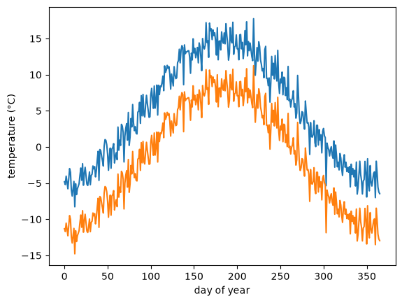
Nothing forces the independent variable onto the x-axis. Swapping the arguments plots it vertically instead — which is how an atmospheric profile is read, with altitude increasing upwards.
altitude_m = np.arange(0, 4001, 250)
profile_celsius = 15.0 - 6.5 * altitude_m / 1000.0   # standard lapse rate, 6.5 °C per km

fig, ax = plt.subplots(figsize=(3.5, 4.5))
ax.plot(profile_celsius, altitude_m)
ax.set_xlabel("temperature (°C)")
ax.set_ylabel("altitude (m)")
plt.show()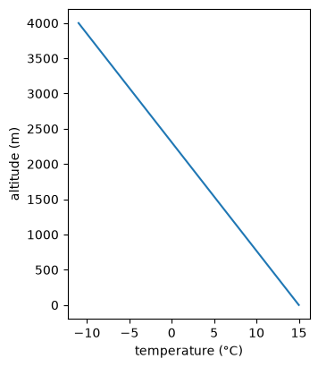
A parametric plot puts one measured quantity on each axis, and the curve is traced out by a third that appears nowhere on the figure. Monthly mean humidity against monthly mean temperature is a standard example: because humidity lags temperature through the year, the twelve months do not fall on a line but trace a loop.
monthly_celsius = ts_celsius[:360].reshape(12, 30).mean(axis=1)
monthly_rh = rh_percent[:360].reshape(12, 30).mean(axis=1)

fig, ax = plt.subplots(figsize=(4.5, 4))
ax.plot(monthly_celsius, monthly_rh, marker="o")
ax.set_xlabel("monthly mean temperature (°C)")
ax.set_ylabel("monthly mean relative humidity (%)")
ax.set_title("one year, month by month")
plt.show()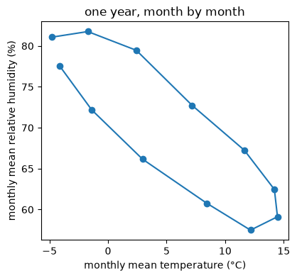
Line styles
linestyle takes either a name or its shorthand: "solid"/"-", "dashed"/"--", "dotted"/":", "dashdot"/"-.". linewidth is in points.
fig, axes = plt.subplots(figsize=(14, 4), ncols=3)

axes[0].plot(days, ts_celsius, linestyle="dashed")
axes[0].plot(days, ridge_celsius, linestyle="--")

axes[1].plot(days, ts_celsius, linestyle="dotted")
axes[1].plot(days, ridge_celsius, linestyle=":")

axes[2].plot(days, ts_celsius, linestyle="dashdot", linewidth=5)
axes[2].plot(days, ridge_celsius, linestyle="-.", linewidth=0.5)

for ax in axes:
    ax.set_xlabel("day of year")
    ax.set_ylabel("temperature (°C)")
plt.tight_layout()
plt.show()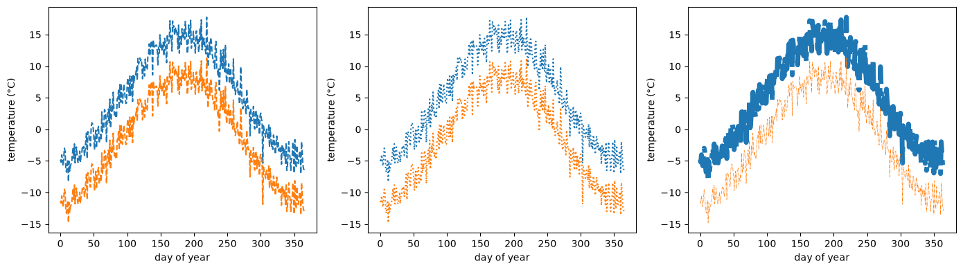
Colors
A handful of single letters are shorthand for the commonest colors:
b: blueg: greenr: redc: cyanm: magentay: yellowk: blackw: white
fig, ax = plt.subplots()
ax.plot(days, ts_celsius, color="k")
ax.plot(days, ridge_celsius, color="r")
ax.set_xlabel("day of year")
ax.set_ylabel("temperature (°C)")
plt.show()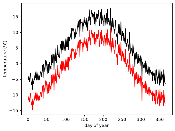
color also accepts a grayscale level as a string between "0" (black) and "1" (white), an RGB tuple of three floats in [0, 1], and a hex code as used in html.
fig, axes = plt.subplots(figsize=(14, 4), ncols=3)

# grayscale
axes[0].plot(days, ts_celsius, color="0.8")
axes[0].plot(days, ridge_celsius, color="0.2")

# RGB tuple
axes[1].plot(days, ts_celsius, color=(1, 0, 0.7))
axes[1].plot(days, ridge_celsius, color=(0, 0.4, 0.3))

# html hex code
axes[2].plot(days, ts_celsius, color="#00dcba")
axes[2].plot(days, ridge_celsius, color="#b029ee")

for ax in axes:
    ax.set_xlabel("day of year")
    ax.set_ylabel("temperature (°C)")
plt.tight_layout()
plt.show()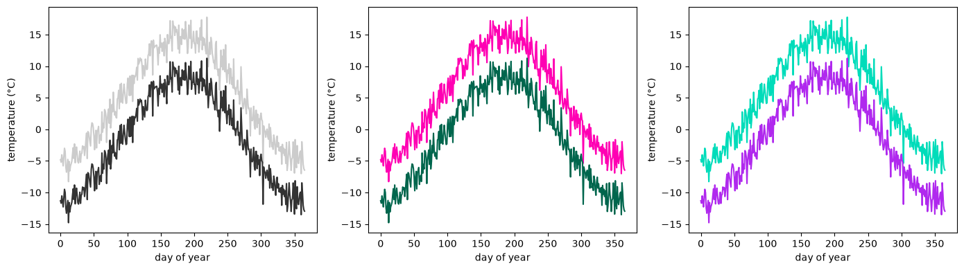
Lines drawn without a color argument take the next entry from a default color cycle, which matplotlib keeps in its runtime configuration dictionary plt.rcParams.
plt.rcParams["axes.prop_cycle"]The cycle holds ten colors, and starts over at the eleventh line — so a figure with more than ten series needs something other than color to tell them apart.
fig, ax = plt.subplots(figsize=(8, 5))
for elevation_m in np.arange(0, 2200, 200):
    ax.plot(days, ts_celsius - 6.5 * elevation_m / 1000.0, label=f"{elevation_m} m")
ax.set_xlabel("day of year")
ax.set_ylabel("temperature (°C)")
ax.legend(ncols=2, fontsize=8, title="station elevation")
plt.show()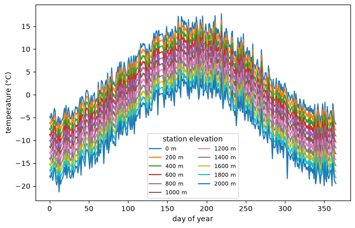
Markers
marker draws a symbol at each data point; matplotlib offers dozens of them. markersize, markerfacecolor, and markeredgecolor control how each symbol is drawn, independently of the line joining them.
fig, axes = plt.subplots(figsize=(12, 4), ncols=2)

axes[0].plot(days[:20], ts_celsius[:20], marker=".")
axes[0].plot(days[:20], ridge_celsius[:20], marker="o")

axes[1].plot(days[:20], ridge_celsius[:20], marker="^",
             markersize=10, markerfacecolor="r",
             markeredgecolor="k")

for ax in axes:
    ax.set_xlabel("day of year")
    ax.set_ylabel("temperature (°C)")
plt.tight_layout()
plt.show()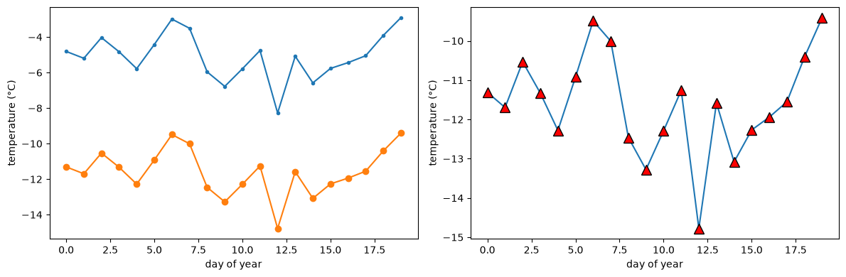
Setting linestyle="none" leaves the markers and drops the line, which is what you want for data that were measured at discrete times rather than sampled from something continuous.
fig, ax = plt.subplots(figsize=(6, 3))
ax.plot(days, ts_celsius, color="tab:red", label="daily")
ax.plot(days[::30], ts_celsius[::30], color="black", linestyle="none",
        marker="o", label="monthly sample")
ax.set_xlabel("day of year")
ax.set_ylabel("temperature (°C)")
ax.legend()
plt.show()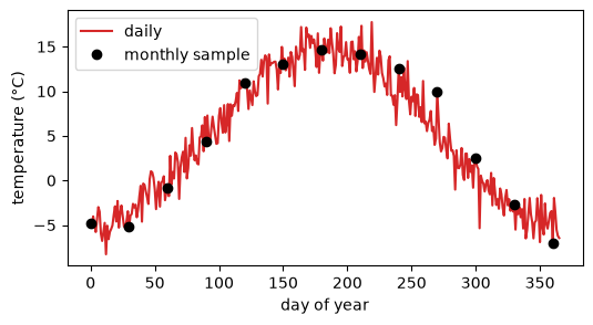
Labels, ticks, and gridlines
set_xticks/set_yticks choose where the tick marks fall and set_xticklabels replaces their text, which is how a day-of-year axis becomes a month axis. Passing minor=True adds a second, finer set of ticks, and grid(which=...) draws gridlines at either set. Any label can contain mathtext between dollar signs — r"discharge (m$^3$ s$^{-1}$)" renders the exponents properly.
fig, ax = plt.subplots(figsize=(10, 5))
ax.plot(days, ts_celsius)

ax.set_xlabel("month")
ax.set_ylabel("temperature (°C)")
ax.set_title("valley station, daily mean air temperature")

ax.set_xticks([0, 90, 180, 270, 365])
ax.set_xticklabels(["Jan", "Apr", "Jul", "Oct", "Jan"])
ax.set_yticks(np.arange(-10, 21, 5))                # major ticks: every 5 °C
ax.set_yticks(np.arange(-10, 21, 1), minor=True)    # minor ticks: every 1 °C

ax.grid(which="major", linewidth=1)
ax.grid(which="minor", linestyle="--", linewidth=0.4)
plt.show()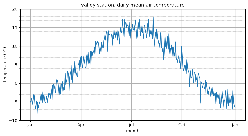
Axis limits
set_xlim/set_ylim crop what is shown without touching the data, which is how you zoom into one part of a record.
fig, ax = plt.subplots(figsize=(6, 3))
ax.plot(days, ts_celsius, days, ridge_celsius)
ax.set_xlim(60, 150)     # zoom to March-May
ax.set_ylim(-5, 15)
ax.set_xlabel("day of year")
ax.set_ylabel("temperature (°C)")
ax.set_title("zoomed to spring")
plt.show()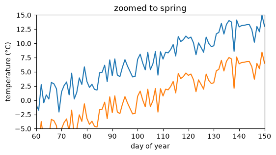
Text annotations
ax.text(x, y, "...") places a label at a data coordinate. ax.annotate does the same but draws an arrow from the text to the point it refers to, which is how you call out a single event in a long record.
warmest_day = int(np.argmax(ts_celsius))
coldest_day = int(np.argmin(ts_celsius))

fig, ax = plt.subplots(figsize=(7, 3.5))
ax.plot(days, ts_celsius)
ax.text(200, 0, "Some notes ...", fontsize=9)
ax.annotate("warmest day", xy=(warmest_day, ts_celsius[warmest_day]),
            xytext=(warmest_day + 50, ts_celsius[warmest_day] - 2),
            arrowprops={"facecolor": "k", "width": 1, "headwidth": 6})
ax.annotate("coldest day", xy=(coldest_day, ts_celsius[coldest_day]),
            xytext=(coldest_day + 40, ts_celsius[coldest_day] + 2),
            arrowprops={"facecolor": "k", "width": 1, "headwidth": 6})
ax.set_xlabel("day of year")
ax.set_ylabel("temperature (°C)")
plt.show()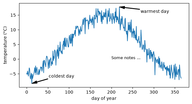
1.4.6 Scatter Plots and Histograms
ax.scatter draws unconnected points, and takes two more arguments that ordinary line plots do not: c maps a third variable to color and s maps a fourth to point area. A scatter plot of two measured quantities against each other, colored by time, shows a relationship and its seasonal drift in one panel. ax.hist bins one variable instead, showing how its values are distributed.
fig, axes = plt.subplots(1, 2, figsize=(10, 3.6))

# color mapped to day of year, size mapped to distance from the annual mean -- a
# third and fourth variable shown without a third and fourth axis
deviation_celsius = np.abs(ts_celsius - ts_celsius.mean())
sc = axes[0].scatter(ts_celsius, rh_percent, c=days,
                     s=5 + 4 * deviation_celsius, cmap="viridis")
fig.colorbar(sc, ax=axes[0], label="day of year")
axes[0].set_xlabel("temperature (°C)")
axes[0].set_ylabel("relative humidity (%)")
axes[0].set_title("humidity against temperature")

axes[1].hist(ts_celsius, bins=24, color="tab:gray")
axes[1].set_xlabel("temperature (°C)")
axes[1].set_ylabel("count (days)")
axes[1].set_title("distribution of daily means")

plt.tight_layout()
plt.show()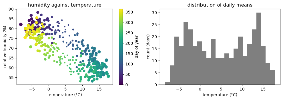
1.4.7 Bar Plots
ax.bar compares values across categories rather than along a continuous axis, and ax.barh draws the same bars horizontally, which leaves room for long category names.
stations = ["valley", "ridge", "mountain"]
annual_mean_celsius = [ts_celsius.mean(), ridge_celsius.mean(), mountain_celsius.mean()]

fig, axes = plt.subplots(figsize=(10, 3.5), ncols=2)
axes[0].bar(stations, annual_mean_celsius, color="tab:orange")
axes[0].set_ylabel("annual mean temperature (°C)")

axes[1].barh(stations, annual_mean_celsius, color="tab:orange")
axes[1].set_xlabel("annual mean temperature (°C)")

plt.tight_layout()
plt.show()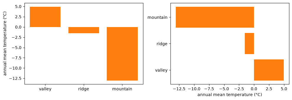
1.4.8 Two-Dimensional Fields
A gridded field — temperature over a region, pressure over an ocean basin — is a 2D array plus the coordinates of its grid. matplotlib offers three ways to draw one, and they differ in exactly one respect: what they do with those coordinates.
imshow
imshow treats the array as an image and draws it by array position, ignoring coordinates entirely. It is the fastest of the three, and the one that can silently mislead: its default origin="upper" puts row 0 at the top, which is right for a photograph and wrong for a field whose first row is its southernmost latitude. origin="lower" puts row 0 at the bottom.
lat = np.array([46.0, 46.5, 47.0, 47.5])          # ascending: south -> north
lon = np.array([6.5, 7.0, 7.5, 8.0, 8.5, 9.0])
field_celsius = 5.0 + (46.0 - lat)[:, None] * 3.0 + rng.normal(0, 1.0, size=(4, 6))  # colder north
print(field_celsius.shape)

fig, axes = plt.subplots(figsize=(11, 3.4), ncols=2)

im0 = axes[0].imshow(field_celsius)                 # default: row 0 at the top
fig.colorbar(im0, ax=axes[0], label="temperature (°C)")
axes[0].set_title("imshow() default, origin='upper'")

im1 = axes[1].imshow(field_celsius, origin="lower")  # row 0 (south) at the bottom
fig.colorbar(im1, ax=axes[1], label="temperature (°C)")
axes[1].set_title("imshow(origin='lower')")

for ax in axes:
    ax.set_xlabel("longitude index")
    ax.set_ylabel("latitude index")
plt.tight_layout()
plt.show()
(4, 6)
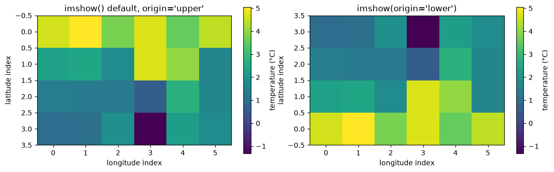
Both axes are labelled in index, not in degrees, because that is genuinely all imshow knows. The two panels show the same array, one of them upside down, and nothing in the figure says which.
pcolormesh
pcolormesh draws one filled quadrilateral per grid cell and takes the coordinates as arguments, so the axes come out in degrees rather than in index. The coordinates can be given as two 1D arrays or as the two 2D arrays that np.meshgrid builds from them; the result is identical.
lon2d, lat2d = np.meshgrid(lon, lat)
print(lon2d.shape, lat2d.shape)

fig, axes = plt.subplots(ncols=2, figsize=(11, 3.6))
pc0 = axes[0].pcolormesh(lon, lat, field_celsius)          # 1D coordinates
pc1 = axes[1].pcolormesh(lon2d, lat2d, field_celsius)      # 2D coordinates: same thing
fig.colorbar(pc0, ax=axes[0], label="temperature (°C)")
fig.colorbar(pc1, ax=axes[1], label="temperature (°C)")

for ax in axes:
    ax.set_xlabel("longitude (°E)")
    ax.set_ylabel("latitude (°N)")
plt.tight_layout()
plt.show()
(4, 6) (4, 6)
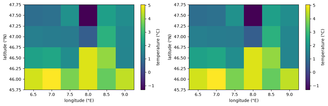
The coordinates mean two different things depending on the shading argument, which catches people out. Under the default shading="auto", the coordinates you pass are the centres of the cells, and there are as many of them as there are values. Under shading="flat" they are the cell corners, so each axis needs one more coordinate than it has values — pass a coordinate array of the same shape as the data and matplotlib refuses rather than quietly dropping a row and a column. The two panels below come out identical, which is the point: the same six-by-four grid of cells, described two different ways.
lon_edges = np.arange(6.25, 9.30, 0.5)    # 7 corners for 6 columns
lat_edges = np.arange(45.75, 47.80, 0.5)  # 5 corners for 4 rows
print(lon_edges.size, lat_edges.size)

fig, axes = plt.subplots(ncols=2, figsize=(11, 3.6))

axes[0].pcolormesh(lon, lat, field_celsius, shading="auto", edgecolors="k")
axes[0].set_title("shading='auto': coordinates are cell centres")

axes[1].pcolormesh(lon_edges, lat_edges, field_celsius, shading="flat", edgecolors="k")
axes[1].set_title("shading='flat': coordinates are cell corners")

for ax in axes:
    ax.set_xlabel("longitude (°E)")
    ax.set_ylabel("latitude (°N)")
plt.tight_layout()
plt.show()
7 5
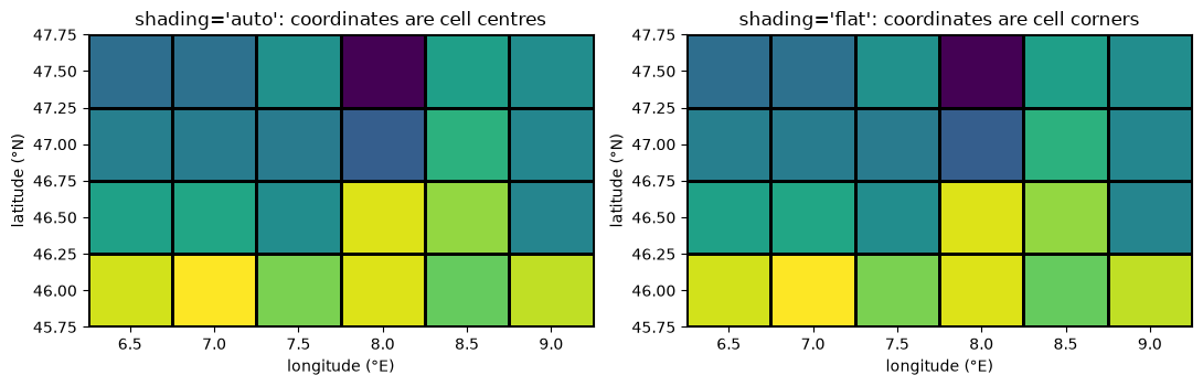
Taking coordinates rather than indices also means pcolormesh can draw a grid whose cells are not rectangles at all. Ocean and regional climate models routinely run on such grids — rotated, stretched, or curved to follow a coastline — and this is the only one of the three methods that handles them.
# bend the latitude coordinate: the data are unchanged, the grid is not rectangular
lat_curved = lat2d * (1 + 0.004 * np.cos(6 * lon2d))

fig, ax = plt.subplots(figsize=(6, 4))
pcm = ax.pcolormesh(lon2d, lat_curved, field_celsius, shading="auto", edgecolors="w")
ax.scatter(lon2d, lat_curved, c="k", s=8)
fig.colorbar(pcm, ax=ax, label="temperature (°C)")
ax.set_xlabel("longitude (°E)")
ax.set_ylabel("latitude (°N)")
ax.set_title("a curvilinear grid")
plt.show()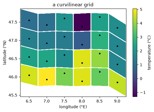
contour and contourf
Contours need a smoother and finer field than the six-by-four temperature grid, so these examples use a synthetic mean sea-level pressure field over the same region: a low centred southwest of the domain, sampled every 0.1°. contour draws the isobars as lines and contourf fills between them. Both accept 1D or 2D coordinates, exactly like pcolormesh.
lon_fine = np.linspace(5.0, 11.0, 61)
lat_fine = np.linspace(45.0, 48.5, 36)
lon_f2d, lat_f2d = np.meshgrid(lon_fine, lat_fine)

# distance from the centre of the low, in degrees, and a profile that falls off
# smoothly with it: 1 at the centre, 0.5 two degrees out
radius_deg = np.sqrt((lon_f2d - 6.0) ** 2 + (lat_f2d - 46.0) ** 2)
depth = 1.0 / (1.0 + (radius_deg / 2.0) ** 2)
pressure_hpa = 1013.0 - 18.0 * depth
print(pressure_hpa.shape, pressure_hpa.min(), pressure_hpa.max())
(36, 61) 995.0 1010.9574468085107
fig, axes = plt.subplots(figsize=(11, 3.6), ncols=2)

# same thing, 1D and 2D coordinates
axes[0].contour(lon_fine, lat_fine, pressure_hpa)
axes[1].contour(lon_f2d, lat_f2d, pressure_hpa)

for ax in axes:
    ax.set_xlabel("longitude (°E)")
    ax.set_ylabel("latitude (°N)")
plt.tight_layout()
plt.show()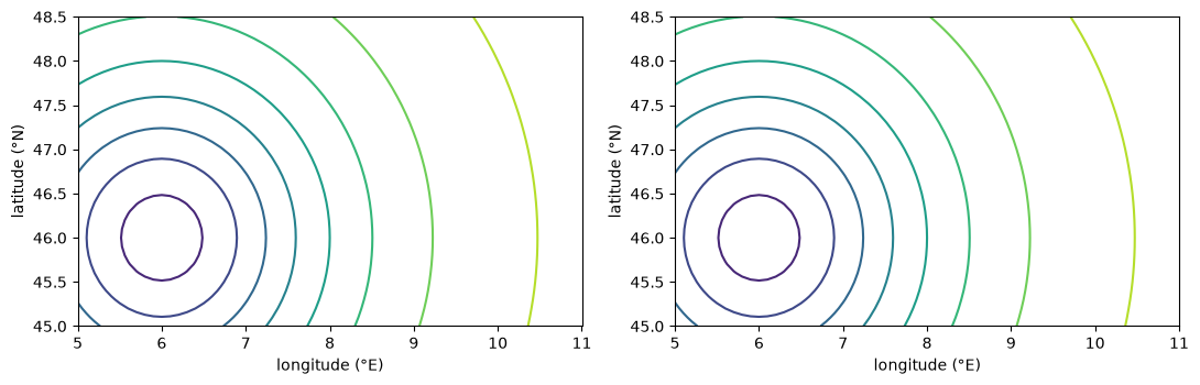
An integer third argument asks for approximately that many contour levels; a sequence of values asks for exactly those. ax.clabel writes the value onto each line, which is how a weather chart labels its isobars, and a colorbar does the same job for filled contours.
fig, axes = plt.subplots(figsize=(11, 4), ncols=2)

c0 = axes[0].contour(lon_f2d, lat_f2d, pressure_hpa, 5)
c1 = axes[1].contour(lon_f2d, lat_f2d, pressure_hpa, 20)

axes[0].clabel(c0, fmt="%4.0f")
fig.colorbar(c1, ax=axes[1], label="pressure (hPa)")

axes[0].set_title("5 levels, labelled")
axes[1].set_title("20 levels, with a colorbar")
for ax in axes:
    ax.set_xlabel("longitude (°E)")
    ax.set_ylabel("latitude (°N)")
plt.tight_layout()
plt.show()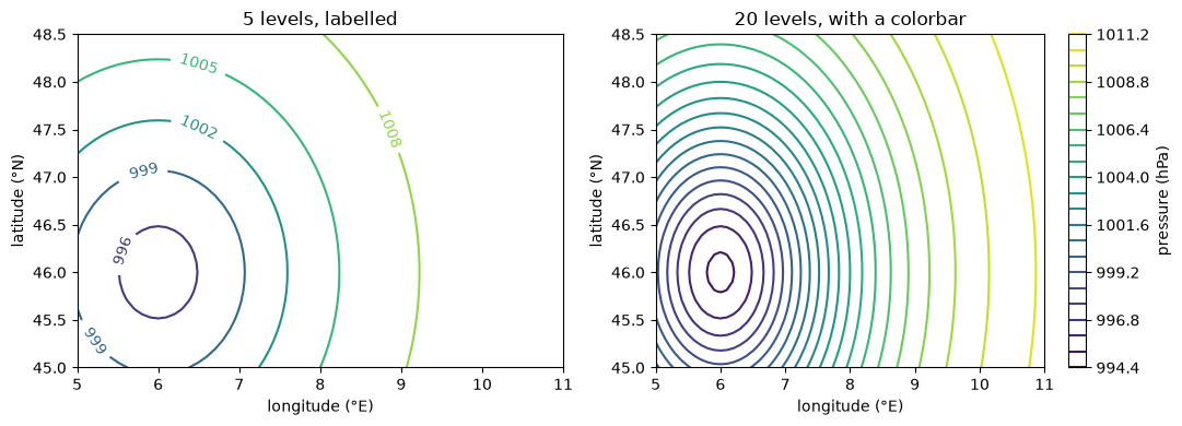
clevels = np.arange(996, 1015, 2)

fig, axes = plt.subplots(figsize=(11, 4), ncols=2)

cf0 = axes[0].contourf(lon_f2d, lat_f2d, pressure_hpa, clevels, cmap="RdBu_r", extend="both")
cf1 = axes[1].contourf(lon_f2d, lat_f2d, pressure_hpa, clevels, cmap="inferno", extend="both")

fig.colorbar(cf0, ax=axes[0], label="pressure (hPa)")
fig.colorbar(cf1, ax=axes[1], label="pressure (hPa)")

axes[0].set_title("cmap='RdBu_r'")
axes[1].set_title("cmap='inferno'")
for ax in axes:
    ax.set_xlabel("longitude (°E)")
    ax.set_ylabel("latitude (°N)")
plt.tight_layout()
plt.show()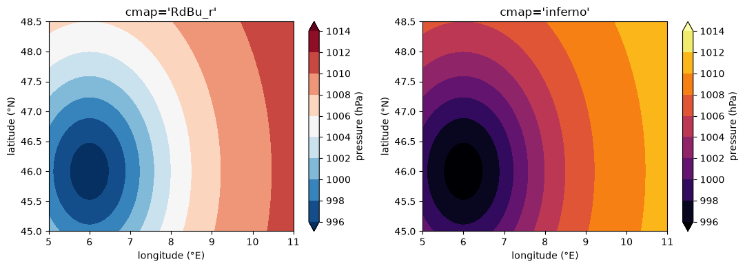
1.4.9 Vector Fields: quiver and streamplot
Wind and ocean currents are vector fields: two components, u (eastward) and v (northward), at every grid point. Under geostrophic balance the wind blows along the isobars rather than across them, counter-clockwise around a low in the northern hemisphere, so the flow below circles the pressure centre from the previous section.
quiver draws one arrow per grid point, which on a 36 × 61 grid would be 2196 overlapping arrows — hence the [::4, ::4] slice, a standard move for wind plots. streamplot traces continuous flow lines instead and stays legible at full resolution.
# an idealised flow along the isobars, counter-clockwise around the low
u_ms = -(lat_f2d - 46.0) * 3.0 * depth
v_ms = (lon_f2d - 6.0) * 3.0 * depth

fig, ax = plt.subplots(figsize=(8, 4.5))
cs = ax.contour(lon_f2d, lat_f2d, pressure_hpa, clevels, colors="gray", zorder=0)
ax.clabel(cs, fmt="%4.0f")
ax.quiver(lon_f2d[::4, ::4], lat_f2d[::4, ::4],
          u_ms[::4, ::4], v_ms[::4, ::4], zorder=1)
ax.set_xlabel("longitude (°E)")
ax.set_ylabel("latitude (°N)")
ax.set_title("isobars (hPa) and geostrophic wind")
plt.show()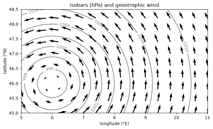
speed_ms = np.sqrt(u_ms**2 + v_ms**2)

fig, ax = plt.subplots(figsize=(8, 4.5))
sp = ax.streamplot(lon_fine, lat_fine, u_ms, v_ms, density=1.5, color=speed_ms, cmap="viridis")
fig.colorbar(sp.lines, ax=ax, label="wind speed (m/s)")
ax.set_xlabel("longitude (°E)")
ax.set_ylabel("latitude (°N)")
ax.set_title("streamlines, coloured by wind speed")
plt.show()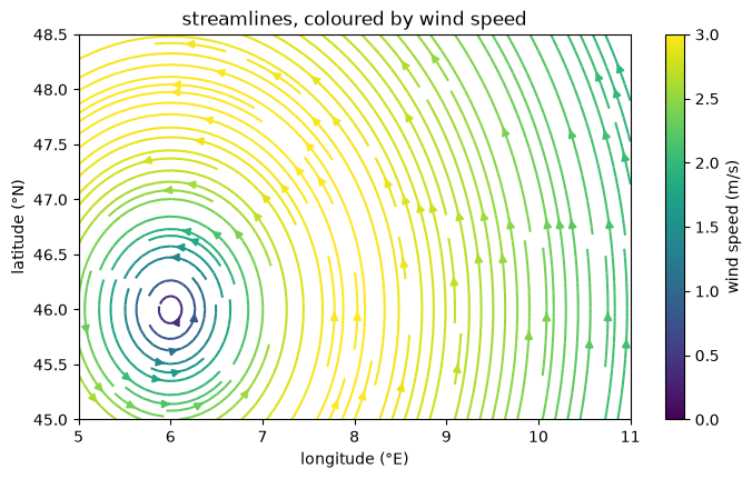
1.4.10 Saving Figures
fig.savefig picks its format from the file extension. Save to a vector format (svg, pdf) for anything that will be printed, projected, or zoomed into: the file stores the lines themselves, so they stay sharp at any size. png stores pixels, and is for quick previews and for figures that are mostly image data anyway.
from pathlib import Path

Path("_files").mkdir(exist_ok=True)

fig, ax = plt.subplots(figsize=(6, 3))
ax.plot(days, ts_celsius, color="tab:red", linewidth=1)
ax.set_xlabel("day of year")
ax.set_ylabel("temperature (°C)")
ax.set_title("daily mean air temperature")
fig.savefig("_files/temperature_timeseries.svg")   # vector
fig.savefig("_files/temperature_timeseries.pdf")   # vector
fig.savefig("_files/temperature_timeseries.png", dpi=200)   # raster

plt.show()
print(sorted(p.name for p in Path("_files").glob("temperature_timeseries.*")))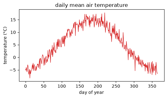
['temperature_timeseries.pdf', 'temperature_timeseries.png', 'temperature_timeseries.svg']
1.4.11 A Plot Nobody Can Read
Every method above can be called correctly and still produce a figure that tells an audience nothing. Here is a month of summer temperature at two of the stations, plotted with all of matplotlib’s defaults and none of its labels — the figure you get by stopping at the first one that appears.
summer = np.arange(180, 210)

fig, ax = plt.subplots(figsize=(3.5, 2.2))
ax.plot(ts_celsius[summer], color="red")
ax.plot(ridge_celsius[summer], color="green")
plt.show()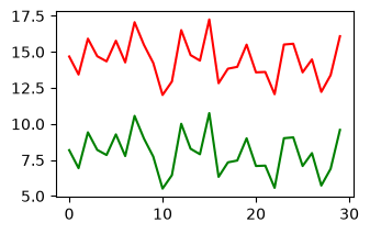
Every point in that figure is at its correct value, and it is still unusable. There is no unit on either axis, so the vertical swings could be 5 °C or 5 K or 5 %. The horizontal axis runs from 0 to 29 because it is plotting array positions, not the days 180 to 209 the data actually cover. Two lines are distinguished only by being red and green — the one pair that the roughly 8 % of men with red–green colour-vision deficiency cannot separate — and nothing says which station is which.
Then there is the vertical range, which fits itself to whatever the data happen to span. Here that is one month, so day-to-day summer weather fills the panel as dramatically as a full seasonal cycle would, and nothing on the figure says that these same two records swing through 25 °C over a year. At this size the tick labels are also a few pixels tall on a projector.
The same data, with each of those fixed:
fig, ax = plt.subplots(figsize=(7.5, 4))
ax.plot(days, ts_celsius, color="tab:blue", label="valley station")
ax.plot(days, ridge_celsius, color="tab:orange", linestyle="--",
        label="ridge station (1000 m higher)")
ax.axvspan(180, 210, color="0.9", zorder=0)   # axvspan shades a range of x
ax.text(195, 19, "the month plotted above", fontsize=10, ha="center")

ax.set_ylim(-20, 22)     # room for the annotation, and a range chosen on purpose
ax.set_xlabel("day of year, 2024", fontsize=12)
ax.set_ylabel("daily mean air temperature (°C)", fontsize=12)
ax.set_title("two stations, 1000 m apart in elevation", fontsize=13)
ax.tick_params(labelsize=11)
ax.legend(fontsize=11, loc="lower right")
plt.tight_layout()
plt.show()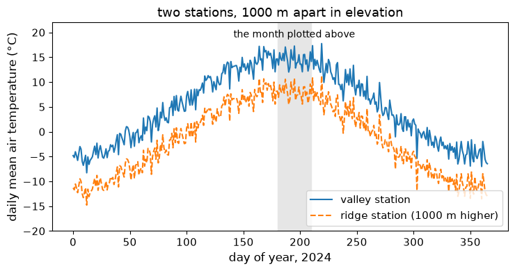
Seen against the whole year, the month that filled the first panel is a flat stretch in a 25 °C seasonal cycle. Nothing was recomputed to get from one figure to the other.
1.4.12 Best Practices for Figures in a Talk
A figure in a paper is read from 40 cm away by someone who can go back and re-read the caption. A figure in a talk is read from 10 m away by someone who gets one pass at it while you are talking over it. The second is the harder constraint, so run every figure through the list below before it goes on a slide.
Figure 2:The cartopy logo, from the project’s own documentation.
1.4.13 Maps with cartopy
A projection turns a round Earth into a flat axes. cartopy adds that step to matplotlib: give the axes a projection, then add geographic layers on top of it. cfeature.LAND and cfeature.OCEAN fill land and ocean with real colour, and coastlines() draws the boundary between them — a genuine map, not a gradient of measured values.
import cartopy.crs as ccrs
import cartopy.feature as cfeature

fig, ax = plt.subplots(figsize=(8, 4), subplot_kw={"projection": ccrs.PlateCarree()})
ax.add_feature(cfeature.OCEAN, facecolor="#a6cee3")
ax.add_feature(cfeature.LAND, facecolor="#b2df8a")
ax.add_feature(cfeature.COASTLINE, linewidth=0.5)
ax.gridlines(draw_labels=True, linewidth=0.3, alpha=0.5)
ax.set_title("PlateCarree")
plt.show()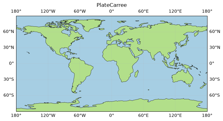
A tour of standard projections
Only projection= changes below — the same add_feature calls draw into whichever axes they are given. PlateCarree is the simplest (longitude and latitude plotted directly, unchanged); Mercator, built for 16th-century sea navigation, preserves angles but inflates area toward the poles — Greenland ends up looking larger than Africa, though Africa’s true area is about 14 times greater; Robinson and Orthographic are compromises, chosen for how a global view looks rather than for any one preserved property.
projections = [ccrs.PlateCarree(), ccrs.Robinson(), ccrs.Mercator(),
               ccrs.Orthographic(central_longitude=10, central_latitude=45)]
names = ["PlateCarree", "Robinson", "Mercator", "Orthographic"]

fig = plt.figure(figsize=(10, 6))
for i, (proj, name) in enumerate(zip(projections, names)):
    ax = fig.add_subplot(2, 2, i + 1, projection=proj)
    ax.add_feature(cfeature.OCEAN, facecolor="#a6cee3")
    ax.add_feature(cfeature.LAND, facecolor="#b2df8a")
    ax.add_feature(cfeature.COASTLINE, linewidth=0.4)
    ax.set_title(name)
plt.tight_layout()
plt.show()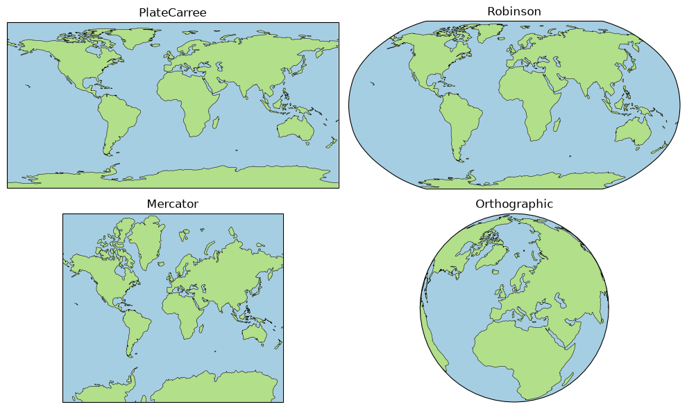
Equal Earth: an equal-area alternative
EqualEarth, published in 2018, keeps land areas in true relative proportion — no continent is inflated to look bigger than it really is. On 4 September 2026 the UN General Assembly adopted the “Correct the Map” resolution, recommending Equal Earth over Mercator for general-purpose world maps: 164 member states in favour, six abstaining, one against (the United States). The resolution does not bind any organisation to switch, but it marks Equal Earth as the closest thing to an international standard for a general-reference world map today.
fig, ax = plt.subplots(figsize=(8, 4), subplot_kw={"projection": ccrs.EqualEarth()})
ax.add_feature(cfeature.OCEAN, facecolor="#a6cee3")
ax.add_feature(cfeature.LAND, facecolor="#b2df8a")
ax.add_feature(cfeature.COASTLINE, linewidth=0.4)
ax.set_title("Equal Earth")
plt.show()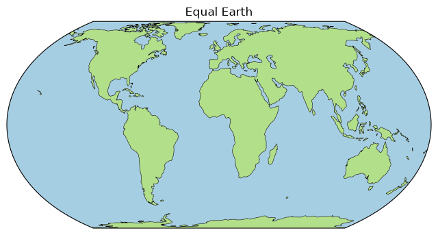
Spilhaus: centred on the ocean, not the land
Every projection so far centres the world on its land. Spilhaus, devised by Athelstan Spilhaus in 1942, does the opposite: centred on Antarctica, it slices the continents apart instead of the ocean, so the Pacific, Atlantic, Indian, and Southern Oceans appear as one unbroken body of water. No standard world map can show that a current can, in principle, carry water from any ocean basin to any other — Spilhaus makes it visible at a glance.
fig, ax = plt.subplots(figsize=(6, 6), subplot_kw={"projection": ccrs.Spilhaus()})
ax.add_feature(cfeature.OCEAN, facecolor="#a6cee3")
ax.add_feature(cfeature.LAND, facecolor="#b2df8a")
ax.add_feature(cfeature.COASTLINE, linewidth=0.4)
ax.set_title("Spilhaus")
plt.show()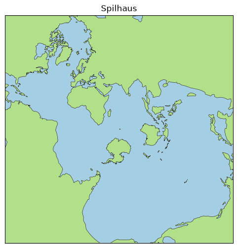
A polar view
SouthPolarStereo centres the projection on the South Pole rather than the equator; set_extent([lon_min, lon_max, lat_min, lat_max], crs=...) then crops the view to a bounding box in a stated crs — here, everything south of 50° S.
fig, ax = plt.subplots(figsize=(5, 5), subplot_kw={"projection": ccrs.SouthPolarStereo()})
ax.set_extent([-180, 180, -90, -50], crs=ccrs.PlateCarree())
ax.add_feature(cfeature.OCEAN, facecolor="#a6cee3")
ax.add_feature(cfeature.LAND, facecolor="#b2df8a")
ax.add_feature(cfeature.COASTLINE, linewidth=0.4)
ax.gridlines()
ax.set_title("South Polar Stereographic")
plt.show()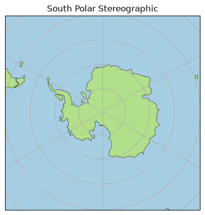
Choosing a projection
There is no single correct projection — only one that fits the question being asked.
Atmospheric science mostly reaches for
PlateCarree: reanalysis and forecast model output is natively a longitude–latitude grid, so plotting it needs no reprojection. For anything centred on the poles — the polar vortex, the ozone hole, sea ice extent — a polar stereographic projection like the one above is standard instead.Oceanography uses
Spilhausspecifically to show that ocean basins are one connected system, which matters for circulation and heat transport that do not respect continental boundaries.Mercatorpersists for its original purpose, marine navigation, since a straight line on a Mercator map is a constant compass bearing.Geography and general reference now points to
EqualEarth, for the reason the UN resolution above gives: it does not exaggerate the size of any region relative to another.
The tools above cover every case here — only projection= and, where a bounding box is needed, set_extent change.
Going deeper: more cartopy features and GeoAxes methods
Beyond LAND, OCEAN, and COASTLINE, cartopy axes accept more geography-specific feature layers.
ax.add_feature(cfeature.BORDERS, linewidth=0.5)   # political borders
ax.add_feature(cfeature.RIVERS)                    # rivers and lake centrelines
ax.add_feature(cfeature.LAKES, facecolor="#a6cee3")
A GeoAxes also has a couple of shortcuts worth knowing: set_global() zooms out to the whole planet in one call, and stock_img() adds a quick low-resolution reference background — handy before any real data is plotted, in place of add_feature.

Figure 3:The xarray logo, from the project’s own documentation.
1.4.14 xarray: Arrays That Carry Their Labels
xarray attaches names and coordinates to numpy arrays. A DataArray is a single labelled array; a Dataset is a dict-like collection of DataArrays sharing coordinates. Operations then refer to dimensions by name (dim="time") instead of by axis number. The example below reuses field_celsius, the exact grid plotted earlier with pcolormesh, as the spatial pattern for a full year of daily fields.
import xarray as xr

time = np.arange("2024-01-01", "2025-01-01", dtype="datetime64[D]")   # 366 days (leap year)
n_time = time.size
doy = np.arange(n_time)
seasonal_celsius = -np.cos(2 * np.pi * doy / n_time) * 10.0      # seasonal cycle

# reuse field_celsius (built earlier, for pcolormesh) as the spatial pattern, add the
# seasonal cycle, and let a smaller day-to-day noise term vary each day
temp_celsius = (field_celsius[None, :, :] + seasonal_celsius[:, None, None]
        + rng.normal(0, 1.0, size=(n_time, 4, 6)))

# a DataArray is built directly from an array, its dimension names, its coordinates, and its attrs
t2m = xr.DataArray(
    temp_celsius,
    dims=("time", "lat", "lon"),
    coords={"time": time, "lat": lat, "lon": lon},
    attrs={"units": "degC", "long_name": "2 m air temperature"},
)
print(type(t2m).__name__, "dims:", t2m.dims, "shape:", t2m.shape)

# a Dataset is a dict-like collection of DataArrays that share coordinates
ds = xr.Dataset(
    {"t2m": (("time", "lat", "lon"), temp_celsius)},
    coords={"time": time, "lat": lat, "lon": lon},
)
ds["t2m"].attrs.update(units="degC", long_name="2 m air temperature")
ds["lat"].attrs["units"] = "degrees_north"
ds["lon"].attrs["units"] = "degrees_east"
print(ds)
DataArray dims: ('time', 'lat', 'lon') shape: (366, 4, 6)
<xarray.Dataset> Size: 73kB
Dimensions: (time: 366, lat: 4, lon: 6)
Coordinates:
* time (time) datetime64[s] 3kB 2024-01-01 2024-01-02 ... 2024-12-31
* lat (lat) float64 32B 46.0 46.5 47.0 47.5
* lon (lon) float64 48B 6.5 7.0 7.5 8.0 8.5 9.0
Data variables:
t2m (time, lat, lon) float64 70kB -4.808 -2.57 -6.037 ... -7.164 -7.682
# selecting a variable from a Dataset returns a DataArray
da = ds["t2m"]
print(type(ds).__name__, "->", type(da).__name__)
print("dims:", da.dims)
print("shape:", da.shape)
print("units:", da.attrs["units"])
Dataset -> DataArray
dims: ('time', 'lat', 'lon')
shape: (366, 4, 6)
units: degC
# .isel selects by integer position; .sel selects by coordinate label
print("isel(time=0) shape:", ds["t2m"].isel(time=0).shape)       # one day, drops time

day = ds["t2m"].sel(time="2024-07-15")                           # by label
print("2024-07-15 spatial mean:", day.mean().round(2).item(), "°C")

# nearest-label selection
print("nearest lat to 46.7:", ds["lat"].sel(lat=46.7, method="nearest").item())
isel(time=0) shape: (4, 6)
2024-07-15 spatial mean: 11.93 °C
nearest lat to 46.7: 46.5
# reductions name the dimension; label-aware arithmetic aligns by coordinate
domain_mean = ds["t2m"].mean(dim=("lat", "lon"))   # -> time series
clim_field = ds["t2m"].mean(dim="time")            # -> lat x lon field
print("domain_mean dims:", domain_mean.dims, "| clim_field dims:", clim_field.dims)

anomaly = ds["t2m"] - ds["t2m"].mean(dim="time")
print("anomaly dims:", anomaly.dims, "| mean anomaly:", anomaly.mean().round(3).item())
domain_mean dims: ('time',) | clim_field dims: ('lat', 'lon')
anomaly dims: ('time', 'lat', 'lon') | mean anomaly: 0.0
# resample re-bins time; groupby aggregates by a derived label (calendar month)
monthly = ds["t2m"].resample(time="MS").mean()
print("monthly time steps:", monthly["time"].size)

clim_by_month = ds["t2m"].groupby("time.month").mean()
warmest_month = int(clim_by_month.mean(dim=("lat", "lon")).argmax("month").item()) + 1
print("months:", clim_by_month["month"].values)
print("warmest climatological month:", warmest_month)
monthly time steps: 12
months: [ 1 2 3 4 5 6 7 8 9 10 11 12]
warmest climatological month: 7
Solution
point = ds["t2m"].sel(lat=47.5, lon=7.5)
monthly_point = point.resample(time="MS").mean()
print(monthly_point["time"].size)
xarray’s .plot() reads coordinates, labels, and units straight from the metadata: a 1D array becomes a line, a 2D array a pcolormesh, both labelled automatically. The domain-mean line below echoes the very first plot in this notebook — the same shape of data, now derived by reducing a full spatiotemporal field instead of being handed to you ready-made.
fig, axes = plt.subplots(1, 2, figsize=(10, 3.2))
ds["t2m"].mean(dim=("lat", "lon")).plot(ax=axes[0])   # 1D -> line
ds["t2m"].mean(dim="time").plot(ax=axes[1])           # 2D -> pcolormesh
axes[0].set_title("domain-mean temperature")
axes[1].set_title("time-mean field")
plt.tight_layout()
plt.show()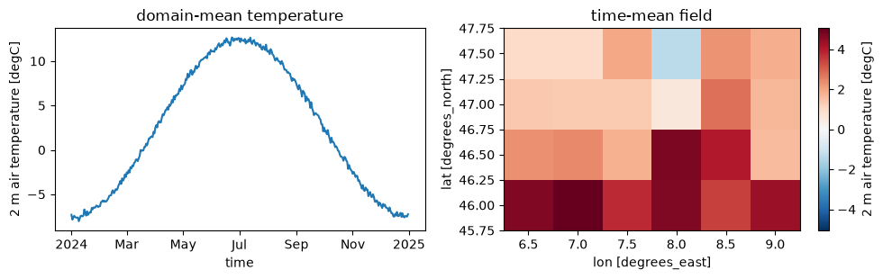
xarray also reads and writes netCDF directly, preserving every coordinate and attribute through the round trip — the self-describing format .npy was not, back in 1.3.
# xarray reads and writes netCDF, preserving coordinates and attributes
from pathlib import Path

Path("_files").mkdir(exist_ok=True)
ds.to_netcdf("_files/air_temperature.nc")
reopened = xr.open_dataset("_files/air_temperature.nc")
print(list(reopened.data_vars), "| units:", reopened["t2m"].attrs["units"])
reopened.close()
['t2m'] | units: degC
Going deeper: lazy loading with dask
Opening a dataset with chunks defers computation: operations build a task graph, and nothing runs until .compute() (or a plot, or a save).
ds = xr.open_dataset("big.nc", chunks={"time": 100})
result = ds["t2m"].mean("time")   # lazy: not yet computed
result.compute()                  # runs the graph, chunk by chunk
This is how xarray scales to datasets far larger than memory.
Going deeper: cloud-native data with zarr (ARCO-ERA5)
Analysis-ready, cloud-optimised datasets such as ARCO-ERA5 are stored as zarr and opened directly over the network, then sliced lazily before anything is downloaded.
store = "gs://gcp-public-data-arco-era5/ar/full_37-1h-0p25deg-chunk-1.zarr-v3"
era5 = xr.open_zarr(store, chunks={"time": 48})
t2m = era5["2m_temperature"].sel(time="2020-01-01")   # lazy slice
This requires network access and the zarr and gcsfs packages, so it is shown for reference and not run in this book.
When generated code lies: a flipped map
AI assistants reach for imshow to display a 2D array. Here, an assistant takes the time-mean of ds["t2m"] — the same xarray Dataset built and plotted throughout this notebook — but pulls out .values before plotting, dropping every coordinate xarray was carrying. By default imshow draws array row 0 at the top of the figure (origin='upper'). Our latitude coordinate is ascending (row 0 is the southernmost), so the map comes out upside down — north and south swapped — with no error and a perfectly plausible-looking picture.
# the "temperature map" as an assistant might generate it, after dropping out of
# xarray back to a bare array
clim_values = ds["t2m"].mean(dim="time").values

fig, ax = plt.subplots(figsize=(5, 3))
im = ax.imshow(clim_values)
fig.colorbar(im, ax=ax, label="temperature (°C)")
ax.set_title("temperature map (as generated)")
ax.set_xlabel("longitude index")
ax.set_ylabel("latitude index")
plt.show()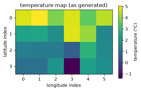
fig, axes = plt.subplots(1, 2, figsize=(10, 3.2))

# left: imshow default -> row 0 (south) drawn at the top, latitude inverted
im0 = axes[0].imshow(clim_values)
fig.colorbar(im0, ax=axes[0], label="°C")
axes[0].set_title("imshow default (flipped)")
axes[0].set_xlabel("longitude index")
axes[0].set_ylabel("latitude index")

# right: pcolormesh with coordinates -> latitude axis correct (north at top)
pcm = axes[1].pcolormesh(lon, lat, clim_values, shading="auto")
fig.colorbar(pcm, ax=axes[1], label="°C")
axes[1].set_title("pcolormesh with coordinates (correct)")
axes[1].set_xlabel("longitude (°E)")
axes[1].set_ylabel("latitude (°N)")

plt.tight_layout()
plt.show()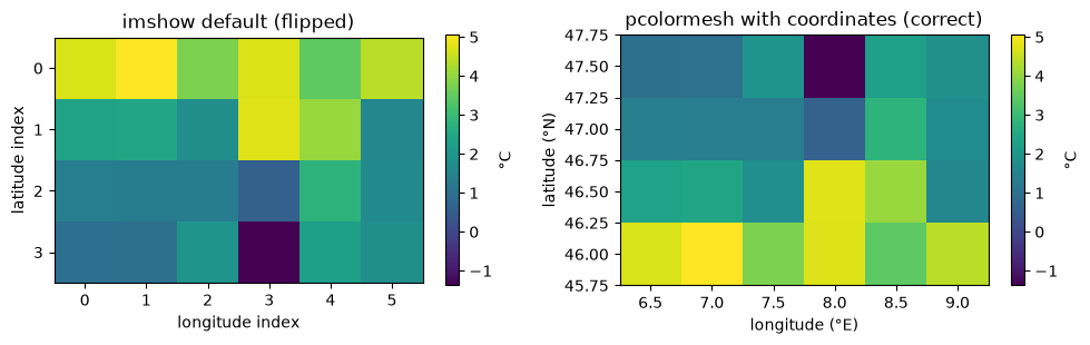
Summary
| Concept | Rule to remember |
|---|---|
| Figure and axes | plt.subplots() covers the common case; fig.add_axes([l, b, w, h]) places one axes explicitly. |
| Draw by name | Use ax.plot and ax.set_xlabel, not plt.plot, which writes into whichever axes is current. |
| Several series | The default colour cycle runs out after ten — add linestyles or markers as well. |
| Two-dimensional fields | imshow draws by array position, so state origin; pcolormesh and contour take the coordinates. |
| Saving | Vector formats (svg, pdf) stay sharp at any size. |
| Readability | A plot can be numerically correct and still unreadable: label the axes, avoid red against green, size text for the room. |
| Maps | projection is the crs you draw in, transform= is the data’s own; no projection is universally correct. |
| xarray | A DataArray is one labelled array; a Dataset is a collection sharing coordinates. |
| Selecting | .sel by label, .isel by position; reduce over named dims, not axis numbers. |
Resources
Pythia Foundations — Matplotlib Basics — the figure/axes model and the core plot types used here.
Cartopy projection list — every projection cartopy supports, each with a small reference plot.
The Spilhaus World Ocean Map in a Square — a story map on how the Spilhaus projection is cut and folded, and what it makes visible about the ocean.
Nature — Hello Equal Earth: what the UN’s new world map will change — background on the September 2026 UN resolution mentioned above.
Pythia Foundations — Introduction to Xarray — DataArray/Dataset, label-based selection, and built-in plotting.
An Introduction to Earth and Environmental Data Science — Abernathey and Key; integrates numpy, matplotlib, and xarray on real geoscience data.