

# Pre-supplied: run this first. Three synthetic station records and a humidity series,
# standing in for a year of daily weather observations.
import numpy as np
import matplotlib.pyplot as plt

rng = np.random.default_rng(1)

days = np.arange(366)                                  # day of year, 2024 (a leap year)
seasonal_celsius = -np.cos(2 * np.pi * days / 366) * 10.0

valley_celsius = 6.0 + seasonal_celsius + rng.normal(0, 1.5, size=366)
ridge_celsius = valley_celsius - 6.5                   # ~1000 m higher
mountain_celsius = valley_celsius - 18.0               # ~2800 m higher

# humidity peaks about a month after the coldest day, so it lags temperature
rh_percent = 68.0 + 12.0 * np.cos(2 * np.pi * (days - 30) / 366) + rng.normal(0, 3.0, size=366)

print(valley_celsius.shape, rh_percent.shape)
(366,) (366,)
Exercise 1: Placing axes by hand
Build a 7 × 3 inch figure with two axes positioned with fig.add_axes: a main panel covering
roughly the left two-thirds, and a smaller one in the upper right. Plot the valley station’s
whole year in the main panel and January alone (days[:31]) in the small one. Label the axes of
both, and give the small panel a title.
# Your solution hereExercise 2: A grid of panels
With plt.subplots(2, 2, figsize=(9, 5)), give each of the three station records and the
humidity series its own panel. Print the shape of the axes array, label every panel with its
quantity and unit, give each a title, and pack the figure with tight_layout.
# Your solution hereExercise 3: Telling series apart without colour
Plot all three station records on one axes so that they stay distinguishable printed in black and white: all three in black, one solid, one dashed, one dotted. Then add every thirtieth point of the valley record as circular markers with no line joining them. Add a legend.
# Your solution hereExercise 4: Ticks, gridlines, and axis limits
Plot the valley record, then:
Replace the x ticks with
["Jan", "Apr", "Jul", "Oct", "Jan"]at days[0, 90, 180, 270, 365].Put major y ticks every 5 °C and minor ones every 1 °C, with a solid major grid and a dotted minor grid.
In a second figure, show only days 150 to 240, with the y-axis limited to 5 to 25 °C.
# Your solution hereExercise 5: Annotate the extremes
Find the warmest and the coldest day of the valley record with np.argmax and np.argmin. Mark
each on the plot with ax.annotate and an arrow, and add a plain ax.text label somewhere in
the summer half of the year.
# Your solution hereExercise 6: A parametric plot
Average both the valley record and the humidity series into twelve monthly means with
[:360].reshape(12, 30).mean(axis=1), then plot humidity against temperature with a marker at
each month. Label both axes. The twelve points trace a loop rather than a line — add a one-line
comment saying what that loop tells you about the two quantities.
# Your solution hereExercise 7: Scatter and histogram
Make a 1 × 2 figure. On the left, scatter humidity against temperature, with point colour mapped to day of year (labelled colorbar) and point size mapped to each day’s absolute departure from the annual mean temperature. On the right, a 24-bin histogram of the temperature. Label every axis.
# Your solution hereExercise 8: Bar and barh
Compute the annual mean of each of the three stations and compare them in a 1 × 2 figure: bar
on the left, barh on the right. Label the value axis with its unit in both.
# Your solution hereExercise 9: One field, three ways
Build the small gridded field below, then draw it three times in a 1 × 3 figure: with imshow
(row 0 is the southernmost latitude, so make it appear at the bottom), with pcolormesh using
the coordinates, and with contourf using 8 levels. Label the imshow panel’s axes in grid
index and the other two in degrees — the difference is the point of the exercise. Give each panel
a labelled colorbar, and save the figure as _files/field.svg.
lon = np.linspace(6.0, 9.0, 6)
lat = np.linspace(46.0, 47.5, 4)      # ascending: south -> north
field_celsius = 6.0 + (46.0 - lat)[:, None] * 3.0 + rng.normal(0, 1.0, size=(4, 6))
# Your solution hereExercise 10: A vector field
Build the synthetic wind field below — a simple rotation, like a cyclone seen from above — and
draw it two ways in a 1 × 2 figure. On the left, quiver at every third grid point, over
contour lines of the wind speed. On the right, streamplot coloured by wind speed, with a
labelled colorbar. Label the axes in km.
x_km = np.linspace(-100, 100, 25)
y_km = np.linspace(-100, 100, 25)
xx_km, yy_km = np.meshgrid(x_km, y_km)
u_ms = -yy_km / 8.0
v_ms = xx_km / 8.0
# Your solution hereExercise 11: Fix the figure
The cell below draws thirty days (days 120 to 149) of the valley and ridge records, and breaks most of the best-practices checklist at the end of the lecture. First list every practice it breaks, as comments. Then redraw the same data so that it passes all of them.
# Pre-supplied: a figure that breaks most of the checklist.
# Leave this cell as it is -- write the corrected version in the next one.
fig, ax = plt.subplots(figsize=(3, 2))
ax.plot(valley_celsius[120:150], color="red")
ax.plot(ridge_celsius[120:150], color="green")
ax.set_title("temps")
plt.show()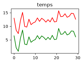
# Your solution hereExercise 12: Build a labelled DataArray
From data = np.arange(12.0).reshape(3, 4), build an xarray DataArray with dimensions
("lat", "lon"), latitude coordinates [46.0, 46.5, 47.0], longitude coordinates
[6.0, 6.5, 7.0, 7.5], and a units attribute of "degC". Print its dims and its units.
# Your solution hereExercise 13: Select and reduce
Build the small Dataset below, then print the spatial mean of the first day (by position) and the time mean at latitude 47.0 (by label).
rng = np.random.default_rng(0)
time = np.arange("2024-01-01", "2024-01-11", dtype="datetime64[D]")
lat = np.array([46.0, 46.5, 47.0]); lon = np.array([6.0, 6.5, 7.0, 7.5])
t = rng.normal(5, 3, size=(10, 3, 4))
ds = xr.Dataset({"t2m": (("time", "lat", "lon"), t)},
                coords={"time": time, "lat": lat, "lon": lon})
# Your solution hereExercise 14: Resample and a monthly climatology
Build a one-year daily temperature DataArray (construction below), compute its monthly means
with resample, print how many there are, then use groupby to find the warmest calendar month
(1–12).
rng = np.random.default_rng(0)
time = np.arange("2024-01-01", "2025-01-01", dtype="datetime64[D]")
n = time.size; doy = np.arange(n)
t = 5 + -np.cos(2 * np.pi * doy / n) * 10 + rng.normal(0, 1.5, n)
da = xr.DataArray(t, dims="time", coords={"time": time}, attrs={"units": "degC"})
# Your solution hereExercise 15: Round-trip through netCDF
Create a 1D temperature DataArray named t2m with a units attribute, write it to
_files/series.nc, reopen it with open_dataset, and print the variable names and the recovered
units.
# Your solution hereExercise 16: A field on a map with cartopy
Rebuild the DataArray da from exercise 12. Plot it on a ccrs.PlateCarree() projection with
.coastlines() and a labelled colorbar, using transform=ccrs.PlateCarree().
# Your solution hereExercise 17: NASA’s real global-temperature record
The file cached below is NASA GISS’s monthly global-mean surface temperature anomaly (°C,
relative to a 1951–1980 baseline), one row per year since 1880, one column per calendar month.
A handful of recent months are still missing, marked ***.
Load it with
np.genfromtxt(path, skip_header=1, delimiter=",", names=True, missing_values="***", filling_values=np.nan). Stack the twelve month columns (data["Jan"], ...,data["Dec"]) into a(year, month)array withnp.column_stack.Wrap it in an xarray
DataArraywith dims("year", "month"), coordinatesyear(fromdata["Year"]) andmonth(np.arange(1, 13)), and aunitsattribute of"degC".Plot the annual mean (
.mean(dim="month"), which skips the missing months automatically) as a line against year.Plot the full
(year, month)DataArray directly with.plot()— xarray draws it as a labelledpcolormesh. Compare what the warming trend looks like read month by month against the single annual line.
# Pre-supplied: download the data file and cache it locally.
import pooch

path = pooch.retrieve(
    url="https://raw.githubusercontent.com/gse-unil/2026_MLEES_book/main/data/part-I/nasa_gistemp_global_temp_anomaly.csv",
    known_hash="sha256:6cfa44e7bbacd9b12cb10bdd64b3182c2735fa3f3a95688e1f7bc8e5dfcece93",
    fname="nasa_gistemp_global_temp_anomaly.csv",
    path=pooch.os_cache("mlees"),
)
# Your solution hereReplicating plots
The four exercises below each show a figure built from a real dataset and ask you to rebuild it
as closely as you can. The data arrive through a pre-supplied pooch cell; everything after that
is yours.
Work towards the target one element at a time — get the data onto the axes first, then the coordinates, then the colours, then the labels — rather than trying to write the whole cell in one go.
Exercise 18: Global surface air temperature and its zonal mean
The three files cached below hold one snapshot of surface air temperature from the
NCEP/NCAR atmospheric reanalysis 1,
as plain numpy arrays: lon (192 longitudes), lat (94 latitudes, running north to south), and
temp_kelvin, the field itself with shape (94, 192) — in kelvin.
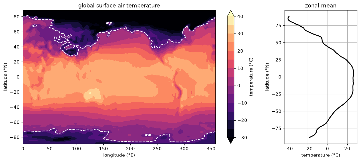
Figure 1:The figure to replicate. Left: the field as filled contours, with a single white contour drawn at −10 °C. Right: the zonal mean — the average along longitude — against latitude.
Load the three arrays with
np.loadand convert the temperature to degrees celsius.Build the two panels with
plt.subplots(1, 2, figsize=(11, 5), gridspec_kw={"width_ratios": [5, 1.5]})—width_ratiosis what makes the left panel wider than the right one.Draw the field with
contourf,cmap="magma",levels=np.linspace(-30, 40, 15)andextend="both", then overlaycontouratlevels=[-10]withcolors="w". matplotlib dashes a contour at a negative level on its own, which is where the dashed white line comes from.The right panel is the mean along the longitude axis, plotted against latitude — so the temperature goes on the x-axis.
np.nanmean(temp_celsius, axis=1)gives it.Label both panels and the colorbar, and finish with
plt.tight_layout().In a comment, say which hemisphere’s winter this snapshot was taken in, and how the zonal mean tells you.
# Pre-supplied: download the three arrays and cache them locally.
import pooch

base_url = "https://raw.githubusercontent.com/gse-unil/2026_MLEES_book/main/data/part-I/"

path_lon = pooch.retrieve(
    url=base_url + "ncep_global_temp_lon.npy",
    known_hash="sha256:eaf54b88dd89279d3034da17fe8470dc2c841bf9fa89b2aa741dacff9c326cdb",
    fname="ncep_global_temp_lon.npy",
    path=pooch.os_cache("mlees"),
)
path_lat = pooch.retrieve(
    url=base_url + "ncep_global_temp_lat.npy",
    known_hash="sha256:af1f438080460e1fca4583b2ec19b44285a3d3776e4d21b8da9b6e162906c88a",
    fname="ncep_global_temp_lat.npy",
    path=pooch.os_cache("mlees"),
)
path_temp = pooch.retrieve(
    url=base_url + "ncep_global_temp_kelvin.npy",
    known_hash="sha256:e040ca257334708b43e86398e09a5669fcf051179ecf5dcd278f758d67beed20",
    fname="ncep_global_temp_kelvin.npy",
    path=pooch.os_cache("mlees"),
)
# Your solution hereExercise 19: Historic significant earthquakes
The file cached below is NOAA’s catalog of significant earthquakes, reaching back to 2150 BCE:
one row per event, tab-separated, 47 columns. The four you need are at positions 8
(FOCAL_DEPTH, km), 9 (EQ_PRIMARY, magnitude), 20 (LATITUDE) and 21 (LONGITUDE).
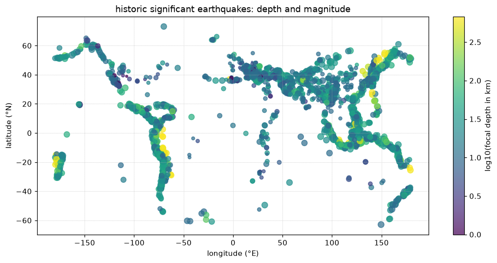
Figure 2:The figure to replicate: every event as one point, coloured by the base-10 logarithm of its focal depth and sized by its magnitude. No coastline is drawn — the plate boundaries are the data.
Load the whole file with
np.genfromtxt(path, delimiter="\t", skip_header=1)and pull out the four columns by position. Every non-numeric field becomesNaN, which is what you want here.Keep only the rows where depth and magnitude are both above zero and latitude and longitude are not
NaN. Build one boolean mask for all four conditions:&combines two masks element-wise (“and”), and~flips one (“not”), so~np.isnan(latitude)is True wherever the latitude is present.Scatter longitude against latitude, with colour mapped to
np.log10of the focal depth — the base-10 logarithm, applied element-wise, which spreads out depths running from under a kilometre to several hundred — and point area to the square of the magnitude. Add a labelled colorbar, axis labels, a title, and a dotted grid.In a comment, name the feature of the Earth that the empty regions of the plot trace out.
# Pre-supplied: download the data file and cache it locally.
import pooch

path = pooch.retrieve(
    url="https://raw.githubusercontent.com/gse-unil/2026_MLEES_book/main/data/part-I/signif.txt.tsv",
    known_hash="sha256:f27e00d335f64ffaf437e74a8efb54f9154d40b417ff93fefb0fd64856e6d345",
    fname="signif.txt.tsv",
    path=pooch.os_cache("mlees"),
)
# Your solution hereExercise 20: Antarctic sea ice, summer against winter
Two real snapshots of Antarctic sea ice concentration from NOAA/NSIDC are cached below, as
path_winter (1 August 2017) and path_summer (31 December 2017). Each holds
seaice_conc_cdr, the ice concentration as a fraction from 0 to 1, on a south polar
stereographic grid — its coordinates are 2D latitude/longitude arrays rather than simple 1D
dimensions, so xarray’s own .plot() will not label it cleanly.
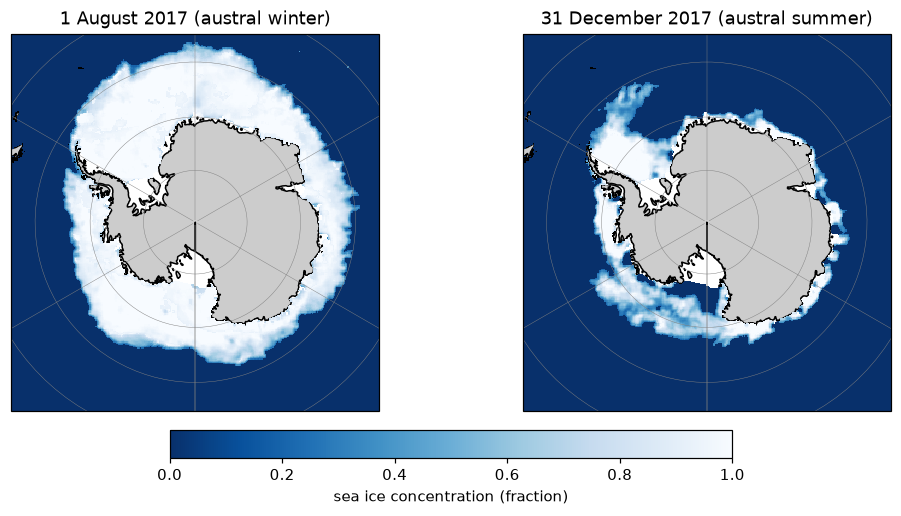
Figure 3:The figure to replicate: the same field on the same projection at two dates, with the land drawn in grey beneath the ice and one colorbar shared by both panels.
Rebuild it, and say which date shows more ice.
# Pre-supplied: download the data files and cache them locally.
import pooch

path_winter = pooch.retrieve(
    url="https://raw.githubusercontent.com/gse-unil/2026_MLEES_book/main/data/part-I/seaice_conc_daily_sh_f17_20170801_v03r01.nc",
    known_hash="sha256:1ff50bca1e6249a9b2fcd9d9466e31bdb5be650243f99c7319ab2ce625b87ce7",
    fname="seaice_conc_daily_sh_f17_20170801_v03r01.nc",
    path=pooch.os_cache("mlees"),
)
path_summer = pooch.retrieve(
    url="https://raw.githubusercontent.com/gse-unil/2026_MLEES_book/main/data/part-I/seaice_conc_daily_sh_f17_20171231_v03r01.nc",
    known_hash="sha256:309418969ad09f42b8104589bcb86de4ed353a5742fef9385baec174c7d55e66",
    fname="seaice_conc_daily_sh_f17_20171231_v03r01.nc",
    path=pooch.os_cache("mlees"),
)
# Your solution here
# Hint: open each file with xr.open_dataset and select the single time step with .isel(time=0)
# Hint: the valid concentration range is 0-1; a few cells carry flag values above 1
# (land, coastal, missing) -- mask them out first with da.where(da <= 1)
# Hint: build a figure with two ccrs.SouthPolarStereo() axes:
# plt.subplots(1, 2, subplot_kw={"projection": ccrs.SouthPolarStereo()})
# Hint: ax.set_extent([-180, 180, -90, -55], ccrs.PlateCarree()) crops each axes to the
# Southern Ocean instead of the whole hemisphere
# Hint: since latitude/longitude are 2D, plot with
# ax.pcolormesh(ds["longitude"], ds["latitude"], masked, transform=ccrs.PlateCarree())
# rather than xarray's own .plot()
# Hint: add cfeature.LAND under the data, gridlines, and one labelled colorbar for both panelsExercise 21: The 2014 earthquakes over North America
The file cached below is the real USGS earthquake catalog for 2014 — one row per event worldwide, with latitude, longitude, depth and magnitude in columns 1 to 4. The target figure keeps the whole catalog and lets the map extent do the selecting, so what you see is a window onto a global dataset rather than a filtered one.
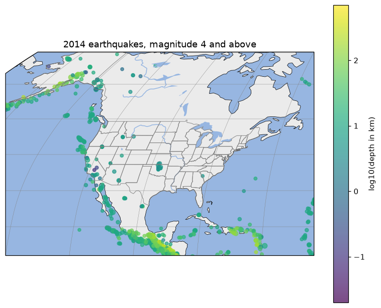
Figure 4:The figure to replicate: magnitude 4 and above, on a Robinson projection cropped to North and Central America, over land, ocean, lake, river and state-boundary features.
Rebuild it.
# Pre-supplied: download the data file and cache it locally.
import pooch

path = pooch.retrieve(
    url="https://raw.githubusercontent.com/gse-unil/2026_MLEES_book/main/data/part-I/usgs_earthquakes_2014.csv",
    known_hash="sha256:84d455fb96dc8f782fba4b5fbe56cb8970cab678f07c766fcba1b1c4674de1b1",
    fname="usgs_earthquakes_2014.csv",
    path=pooch.os_cache("mlees"),
)
# Your solution here
# Hint: load the four numeric columns with
# np.genfromtxt(path, delimiter=",", skip_header=1, usecols=(1, 2, 3, 4))
# -- usecols skips the text columns (time, place, ...) mixed in with the numbers
# Hint: keep mag >= 4 and depth_km > 0 (a few events are recorded at exactly 0 km, which
# np.log10 cannot take); combine the two conditions into one mask with & ("and")
# Hint: fig, ax = plt.subplots(subplot_kw={"projection": ccrs.Robinson()})
# Hint: ax.set_extent([-140, -60, 12, 70], ccrs.PlateCarree()) crops to the window shown
# Hint: the features are cfeature.LAND, cfeature.OCEAN, cfeature.LAKES, cfeature.RIVERS and
# cfeature.STATES; add_feature takes edgecolor, facecolor and linewidth, and STATES
# reads better in gray at a thin linewidth
# Hint: ax.scatter(longitude, latitude, transform=ccrs.PlateCarree(),
# c=np.log10(depth_km), s=mag ** 2)
# -- transform tells cartopy the coordinates are plain lon/lat, not already projected
# Hint: finish with ax.gridlines, a labelled colorbar, and a title