

This closing subchapter connects descriptive statistics to a first supervised model. Using an environmental lapse rate — air temperature as a function of elevation — it moves from exploratory plots, histograms, and correlation, through the scikit-learn estimator interface (instantiate, fit, predict), to an honest evaluation on held-out data with RMSE and the coefficient of determination. It then turns to unsupervised learning on a real dataset — k-means clustering and PCA on Palmer Archipelago penguin measurements — before the generated-code bug. The estimator-as-object pattern is the one introduced in the object-oriented subchapter. At the end, the generated code judges a model by how well it fits the data it was trained on: a near-perfect score on the training set, and a badly wrong prediction on new points.

Figure 1:The seaborn logo, from the project’s own documentation.
1.8.1 Exploratory Data Analysis with seaborn
seaborn draws statistical graphics directly from a dataframe. We generate a synthetic set of stations whose temperature falls with elevation at roughly the environmental lapse rate of −6.5 °C km⁻¹, plus noise, and add a loosely elevation-dependent count of snow days.
seaborn is not a replacement for matplotlib but a layer on top of it: pass column names instead of extracted arrays, and get a sensible default style, a legend, and — for regplot below — a fitted trend line, all in one call. ax= still accepts a matplotlib axes, so the two compose rather than compete; reach for matplotlib directly whenever a plot needs more control than seaborn’s defaults give you.
%matplotlib inline
import warnings
warnings.filterwarnings("ignore", category=FutureWarning)
import numpy as np
import pandas as pd
import seaborn as sns
import matplotlib.pyplot as plt

rng = np.random.default_rng(0)
n = 80
elevation_m = rng.uniform(200, 3500, n)
temp_celsius = 15.0 - 6.5 * (elevation_m / 1000) + rng.normal(0, 1.5, n)
snow_days = 20 + 0.02 * elevation_m + rng.normal(0, 10, n)
df = pd.DataFrame({"elevation_m": elevation_m, "temp_celsius": temp_celsius, "snow_days": snow_days})

fig, ax = plt.subplots(figsize=(5, 3.5))
sns.regplot(data=df, x="elevation_m", y="temp_celsius", ax=ax,
            scatter_kws={"s": 15}, line_kws={"color": "tab:red"})
ax.set_xlabel("elevation (m)")
ax.set_ylabel("temperature (°C)")
plt.show()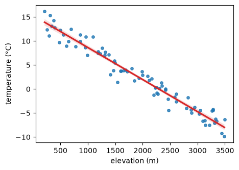
1.8.2 The Palmer Penguins Dataset
The second half of this subchapter works on a real dataset: the Palmer Penguins, collected by Kristen Gorman at Palmer Station, Antarctica. It holds 344 records of the physical attributes of penguins in the Palmer Archipelago, belonging to three species — two of them have no body measurements at all and are dropped below, leaving 342.
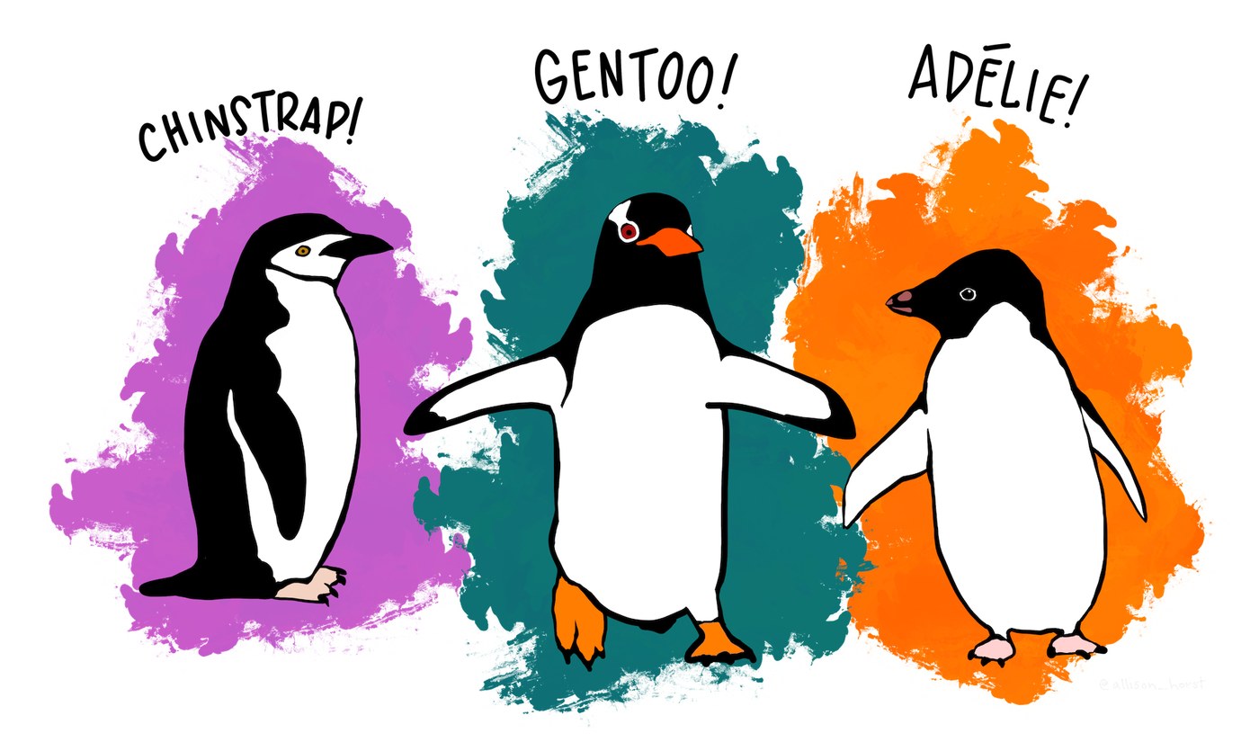
Figure 2:The three species in the dataset. Artwork by Allison Horst (@allison_horst), from the
palmerpenguins package. Data by
K. Gorman and the Palmer Station Antarctica LTER, released under CC-0.
1.8.3 Histograms, KDE, and Density Plots
A histogram counts observations into bins; a kernel density estimate (KDE) smooths that count into a continuous curve. sns.histplot and sns.kdeplot take the same data=/x= arguments as the rest of seaborn, and hue= splits either one by a categorical column in a single call — no manual loop over groups needed. The examples below use real measurements of three penguin species from the Palmer Archipelago, Antarctica (Horst, Hill & Gorman, 2020; palmerpenguins, doi:10.5281/zenodo.3960218; data collected by the Palmer Station Antarctica LTER and K. Gorman).
# Pre-supplied: download the data file and cache it locally.
# You do not need to understand this cell yet — fetching data is covered in the
# reproducible-data-pipelines bonus subchapter.
import pooch

penguins_path = pooch.retrieve(
    url="https://raw.githubusercontent.com/gse-unil/2026_MLEES_book/main/data/part-I/palmer_penguins.csv",
    known_hash="sha256:f204db2c753b0937caac3cb35258562c14f073e4bbc76be24b4c51ce22767a93",
    fname="palmer_penguins.csv",
    path=pooch.os_cache("mlees"),
)

penguins = pd.read_csv(penguins_path).dropna(
    subset=["bill_length_mm", "bill_depth_mm", "flipper_length_mm", "body_mass_g"]
).reset_index(drop=True)
fig, ax = plt.subplots(figsize=(6, 3.5))
sns.histplot(data=penguins, x="body_mass_g", hue="species", kde=True, ax=ax, alpha=0.4)
ax.set_xlabel("body mass (g)")
plt.show()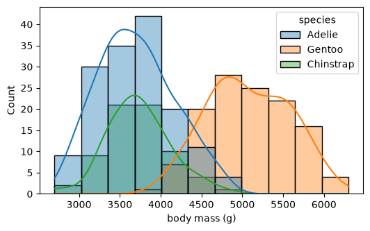
kdeplot also works on two variables at once, showing where two measurements co-vary rather than just their individual spreads; jointplot adds the two 1D marginal densities for free.
sns.jointplot(data=penguins, x="bill_length_mm", y="bill_depth_mm", hue="species", kind="kde")<seaborn.axisgrid.JointGrid at 0x7fd84f687440>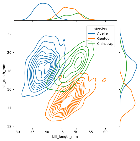
Two of those four measurements describe the bill. The raw data calls them culmen length and depth, after the ridge along the top of the bill; the column names here use the plainer word.
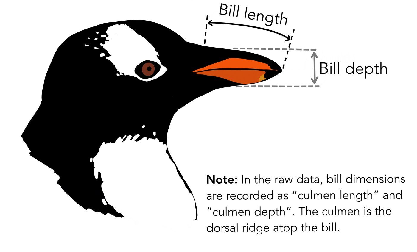
Figure 3:What bill_length_mm and bill_depth_mm measure. Artwork by Allison Horst (@allison_horst), from the
palmerpenguins package.
1.8.4 Descriptive Statistics and Correlation
describe summarises each column; corr gives the pairwise Pearson correlation. Temperature is strongly anti-correlated with elevation — the lapse rate — while snow days rise with it.
print(df.describe().round(2))

fig, ax = plt.subplots(figsize=(4, 3))
sns.heatmap(df.corr().round(2), annot=True, cmap="vlag", vmin=-1, vmax=1, ax=ax)
ax.set_title("Pearson correlation")
plt.show()
elevation_m temp_celsius snow_days
count 80.00 80.00 80.00
mean 1894.42 2.67 56.92
std 978.78 6.68 21.61
min 209.04 -9.87 6.52
25% 1161.85 -2.89 40.06
50% 1960.25 2.51 57.56
75% 2655.25 8.02 72.30
max 3490.79 16.17 99.78
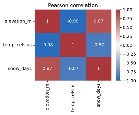

Figure 4:The scikit-learn logo, from the project’s own repository, BSD-3-Clause licensed.
1.8.5 The scikit-learn Estimator Interface
scikit-learn covers three pillars of statistical modelling, and this subchapter touches all three: regression, which learns the relationship between continuous inputs and a continuous output; classification, which learns which of a set of classes an observation belongs to; and clustering, which groups observations that resemble each other without being told what the groups are.
Every scikit-learn model is an object used the same way: instantiate it, fit it to a feature
matrix X and target vector y, then predict. By convention X is two-dimensional with shape
(n_samples, n_features) and y is one-dimensional. The fitted parameters are stored on attributes
ending in an underscore.
For a straight line , fit chooses the slope and intercept that
minimise the sum of squared errors
solved directly rather than by trial and error. Least squares is what makes the fitted line the one that passes as close as possible to every point at once.
from sklearn.linear_model import LinearRegression

X = df[["elevation_m"]]     # 2D feature matrix (note the double brackets)
y = df["temp_celsius"]      # 1D target

model = LinearRegression().fit(X, y)
lapse_rate = model.coef_[0] * 1000          # °C per km
print("recovered lapse rate:", round(lapse_rate, 2), "°C km^-1")
print("intercept (sea-level temp):", round(model.intercept_, 2), "°C")
print("prediction at 2000 m:", round(model.predict(pd.DataFrame({"elevation_m": [2000]}))[0], 2), "°C")
recovered lapse rate: -6.67 °C km^-1
intercept (sea-level temp): 15.31 °C
prediction at 2000 m: 1.96 °C
The recovered lapse rate is close to the −6.5 °C km⁻¹ built into the data, but not exact: 80 noisy stations only pin it down so far. More data narrows the gap.
for n_stations in (80, 800, 8000):
    elev = rng.uniform(200, 3500, n_stations)
    temp = 15.0 - 6.5 * (elev / 1000) + rng.normal(0, 1.5, n_stations)
    fitted = LinearRegression().fit(elev.reshape(-1, 1), temp)
    print(f"{n_stations:5d} stations -> lapse rate {fitted.coef_[0] * 1000:6.2f} °C km^-1, "
          f"intercept {fitted.intercept_:5.2f} °C")
80 stations -> lapse rate -6.35 °C km^-1, intercept 14.61 °C
800 stations -> lapse rate -6.54 °C km^-1, intercept 15.04 °C
8000 stations -> lapse rate -6.51 °C km^-1, intercept 15.02 °C
1.8.6 Train/Test Split, RMSE, and R^2
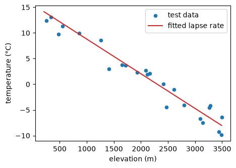
A model must be judged on data it has not seen. train_test_split holds out a test set; the root-mean-square error (RMSE) reports the typical error in the target’s units, and R^2 the fraction of variance explained.
from sklearn.model_selection import train_test_split
from sklearn.metrics import root_mean_squared_error, r2_score

X_train, X_test, y_train, y_test = train_test_split(X, y, test_size=0.3, random_state=0)
model = LinearRegression().fit(X_train, y_train)
y_pred = model.predict(X_test)

print("test RMSE:", round(root_mean_squared_error(y_test, y_pred), 3), "°C")
print("test R^2: ", round(r2_score(y_test, y_pred), 3))

fig, ax = plt.subplots(figsize=(5, 3.5))
ax.scatter(X_test["elevation_m"], y_test, s=20, label="test data")
grid = pd.DataFrame({"elevation_m": np.linspace(X["elevation_m"].min(), X["elevation_m"].max(), 100)})
ax.plot(grid["elevation_m"], model.predict(grid), color="tab:red", label="fitted lapse rate")
ax.set_xlabel("elevation (m)")
ax.set_ylabel("temperature (°C)")
ax.legend()
plt.show()
test RMSE: 1.595 °C
test R^2: 0.947
1.8.7 Scaling and Pipelines
Many estimators (regularised regressions, distance-based methods) require features on comparable scales; StandardScaler centres and scales them. A Pipeline chains preprocessing and model into one estimator, so the scaler is fitted on the training data only — which is exactly what prevents information from the test set leaking into training.
from sklearn.pipeline import make_pipeline
from sklearn.preprocessing import StandardScaler

pipe = make_pipeline(StandardScaler(), LinearRegression())
pipe.fit(X_train, y_train)
print("pipeline test R^2:", round(pipe.score(X_test, y_test), 3))
# for ordinary least squares, scaling leaves predictions unchanged; the habit matters
# for regularised and distance-based models, where unscaled features distort the fit
pipeline test R^2: 0.947
1.8.8 Linear Classification
Not every target is continuous. When y is a category — here, whether a station’s reading fell below freezing — a classifier follows the identical fit/predict interface. LogisticRegression is the classification analogue of linear regression: it fits a linear boundary in feature space and reports class probabilities rather than a continuous value.
from sklearn.linear_model import LogisticRegression

df["frost"] = (df["temp_celsius"] < 0.0).astype(int)
X_clf, y_clf = df[["elevation_m"]], df["frost"]
Xc_train, Xc_test, yc_train, yc_test = train_test_split(X_clf, y_clf, test_size=0.3, random_state=0)

clf = LogisticRegression().fit(Xc_train, yc_train)
print("test accuracy:", round(clf.score(Xc_test, yc_test), 3))
print("predicted frost at 3000 m:", bool(clf.predict(pd.DataFrame({"elevation_m": [3000]}))[0]))
test accuracy: 0.958
predicted frost at 3000 m: True
Separating two species by bill shape
That target was manufactured from a threshold, so the classifier had an easy job. A real one: tell an Adelie from a Chinstrap using nothing but the two bill measurements. Gentoo is left out — it is the easy case, separable on almost any pair of features — leaving the two species that overlap.
Look at the two measurements one at a time first. Bill length separates the two species almost completely; bill depth barely separates them at all.
two_species = penguins[penguins["species"].isin(["Adelie", "Chinstrap"])]
bill_columns = ["bill_length_mm", "bill_depth_mm"]

fig, axes = plt.subplots(1, 2, figsize=(10, 3.2))
for ax, column in zip(axes, bill_columns):
    for species, group in two_species.groupby("species"):
        ax.hist(group[column], bins=20, alpha=0.5, label=species)
    ax.set_xlabel(f"{column.replace('_', ' ')}")
    ax.set_ylabel("count")
    ax.legend(fontsize=8)
plt.tight_layout()
plt.show()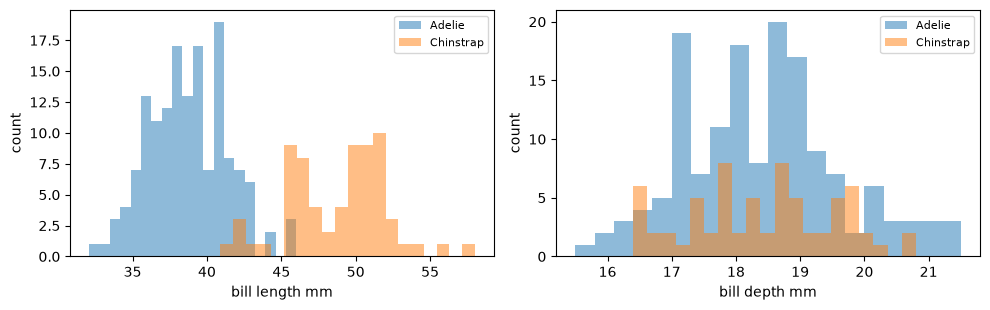
Bill length runs from roughly 32 to 58 mm and bill depth from 15 to 21, so the two features differ
in scale by about a factor of three. Left alone, the fitted weights would reflect that difference
as much as the information in the features, which is exactly what StandardScaler inside a
pipeline prevents.
X_bill = two_species[bill_columns]
y_species = two_species["species"]

Xb_train, Xb_test, yb_train, yb_test = train_test_split(
    X_bill, y_species, test_size=0.3, random_state=0, stratify=y_species
)

bill_clf = make_pipeline(StandardScaler(), LogisticRegression())
bill_clf.fit(Xb_train, yb_train)
print("test accuracy:", round(bill_clf.score(Xb_test, yb_test), 3))
test accuracy: 0.97
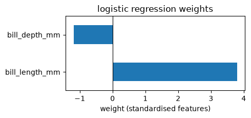
The fitted model is a straight line through the standardised bill plane: one weight per feature plus an intercept. Reading the weights says which measurement the decision actually rests on.
weights = pd.Series(bill_clf[-1].coef_[0], index=bill_columns)
intercept = bill_clf[-1].intercept_[0]
print(weights.round(2))
print("intercept:", round(intercept, 2))

fig, ax = plt.subplots(figsize=(5, 2.4))
weights.plot.barh(ax=ax, color="tab:blue")
ax.axvline(0, color="k", linewidth=0.8)
ax.set_xlabel("weight (standardised features)")
ax.set_title("logistic regression weights")
plt.tight_layout()
plt.show()

# the boundary is the line where the weighted sum crosses zero:
#     w1 * bill_length + w2 * bill_depth + intercept = 0
# bill length carries the larger weight, matching the histograms above
bill_length_mm 3.79
bill_depth_mm -1.19
dtype: float64
intercept: -1.79
1.8.9 Unsupervised Learning: Clustering and Dimensionality Reduction
Every model so far had a known target. Two more scikit-learn estimators follow the same fit/predict shape with no target at all: KMeans groups similar observations, and PCA finds the directions of greatest variance in correlated features. Both are demonstrated on the penguin measurements loaded above.
k-means clustering
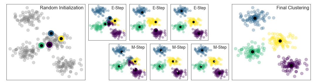
Figure 5:Four successive iterations of k-means on the same points. Each panel assigns every point to its nearest centre and then moves each centre to the mean of the points assigned to it; by the fourth panel neither step changes anything and the algorithm has converged. Figure from Jake VanderPlas, Python Data Science Handbook (code MIT-licensed).
The algorithm alternates two steps until neither changes anything, and it never sees a label.
KMeans partitions points into n_clusters groups by repeatedly assigning each point to the
nearest centroid and moving each centroid to the mean of its group. It is easiest to see on data
built to have clusters: make_blobs draws points around a chosen number of centres, and the
fitted centroids land on them.
from sklearn.cluster import KMeans
from sklearn.datasets import make_blobs

X_blobs, _ = make_blobs(n_samples=300, centers=4, cluster_std=0.60, random_state=0)
km_blobs = KMeans(n_clusters=4, random_state=0, n_init=10).fit(X_blobs)

fig, axes = plt.subplots(1, 2, figsize=(9, 3.5))
axes[0].scatter(X_blobs[:, 0], X_blobs[:, 1], s=15, color="0.5")
axes[0].set_title("300 points, no labels")

axes[1].scatter(X_blobs[:, 0], X_blobs[:, 1], c=km_blobs.labels_, s=15, cmap="viridis")
axes[1].scatter(*km_blobs.cluster_centers_.T, marker="s", s=140, c="white",
                edgecolors="k", linewidths=2, label="centroids")
axes[1].set_title("k-means clusters (k=4)")
axes[1].legend(fontsize=8)
for ax in axes:
    ax.set_xlabel("feature 1")
    ax.set_ylabel("feature 2")
plt.tight_layout()
plt.show()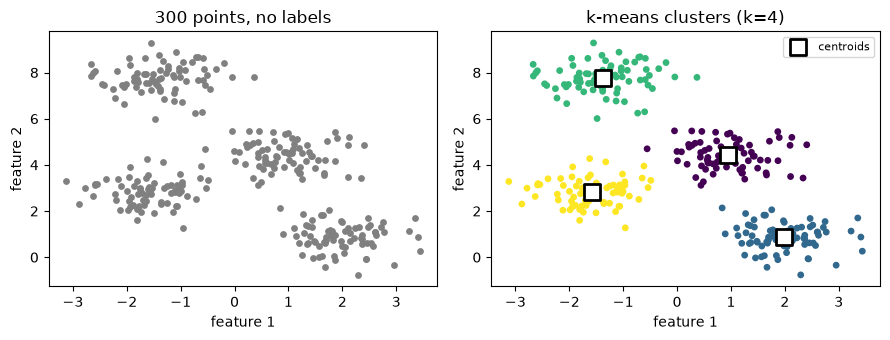
On a real dataset the clusters are rarely that obliging. The penguin measurements below have no
species column as far as KMeans is concerned — it sees two physical measurements and nothing
else.
from sklearn.cluster import KMeans

X_cluster = penguins[["flipper_length_mm", "body_mass_g"]]
kmeans = KMeans(n_clusters=3, random_state=0, n_init=10).fit(X_cluster)
penguins["cluster"] = kmeans.labels_

fig, axes = plt.subplots(1, 2, figsize=(9, 3.5))
for species, group in penguins.groupby("species"):
    axes[0].scatter(group["flipper_length_mm"], group["body_mass_g"], s=15, label=species)
axes[0].set_title("true species")
axes[0].legend(fontsize=8)

axes[1].scatter(X_cluster["flipper_length_mm"], X_cluster["body_mass_g"],
                c=penguins["cluster"], s=15, cmap="viridis")
axes[1].scatter(*kmeans.cluster_centers_.T, marker="x", s=100, color="black", label="centroids")
axes[1].set_title("k-means clusters (k=3)")
axes[1].legend(fontsize=8)
for ax in axes:
    ax.set_xlabel("flipper length (mm)")
    ax.set_ylabel("body mass (g)")
plt.tight_layout()
plt.show()

# crosstab counts how many of each true species fall into each cluster
print(pd.crosstab(penguins["species"], penguins["cluster"]))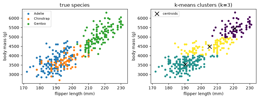
cluster     0    1   2
species
Adelie      0  116  35
Chinstrap   0   53  15
Gentoo     68    1  54
Two features are not quite enough to cleanly separate three species by shape alone: Gentoo (heavier, longer-flippered) forms its own cluster, but Adelie and Chinstrap overlap and mix into the other two clusters — the crosstab shows exactly where. Clustering finds structure in the features you give it; it cannot recover a label the features do not distinguish.
That is a statement about the features, not about the algorithm. Gentoo separates because it is heavier and longer-flippered than the other two; Adelie and Chinstrap overlap because in this plane they genuinely are alike. Swap body mass for bill length, and the same three species come apart — Chinstrap flippers resemble Adelie’s, but Chinstrap bills resemble Gentoo’s.
fig, axes = plt.subplots(1, 2, figsize=(10, 3.8))
for species, group in penguins.groupby("species"):
    axes[0].scatter(group["body_mass_g"], group["flipper_length_mm"], s=18, label=species)
    axes[1].scatter(group["bill_length_mm"], group["flipper_length_mm"], s=18, label=species)

axes[0].set_xlabel("body mass (g)")
axes[0].set_title("the plane clustered above")
axes[1].set_xlabel("bill length (mm)")
axes[1].set_title("a plane that separates the species")
for ax in axes:
    ax.set_ylabel("flipper length (mm)")
    ax.grid(linestyle="--", alpha=0.3)
    ax.legend(fontsize=8)
plt.tight_layout()
plt.show()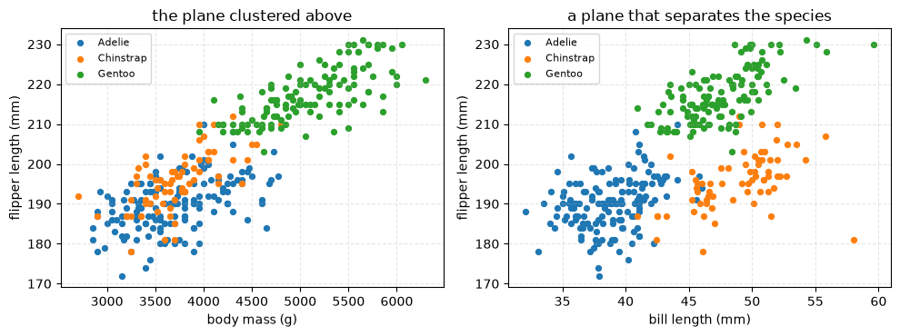
Choosing k: the elbow method
We fixed k=3 because we already know there are three species — in general the right number of clusters is not known in advance. The elbow method refits KMeans across a range of k and plots the inertia (each point’s squared distance to its cluster’s centroid, summed over every point): inertia always falls as k grows, but the rate of improvement drops sharply once extra clusters stop capturing real structure — a bend, or “elbow”, in the curve.
inertias = []
k_values = range(1, 7)
for k in k_values:
    km = KMeans(n_clusters=k, random_state=0, n_init=10).fit(X_cluster)
    inertias.append(km.inertia_)

fig, ax = plt.subplots(figsize=(5, 3.5))
ax.plot(list(k_values), inertias, marker="o")
ax.set_xlabel("number of clusters (k)")
ax.set_ylabel("inertia")
ax.set_title("elbow method")
plt.show()

# sklearn.metrics.silhouette_score is a complementary diagnostic: it scores how
# well-separated the clusters are, without needing a visual bend to read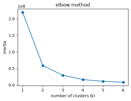
Silhouette analysis
The elbow is not always sharp: here the curve bends somewhere between two and four clusters without saying which. The silhouette score puts a number on it. For one observation,
where is its mean distance to the other points in its own cluster and its mean distance to
the points of the nearest other cluster. A value near 1 means the observation sits comfortably
inside its own cluster; near 0 means it sits on the boundary between two. Averaged over every
observation, the score can be compared across k, and the largest average wins.
from sklearn.metrics import silhouette_score

scores = []
k_range = range(2, 7)
for k in k_range:
    labels = KMeans(n_clusters=k, random_state=0, n_init=10).fit_predict(X_cluster)
    scores.append(silhouette_score(X_cluster, labels))

fig, ax = plt.subplots(figsize=(5, 3.5))
ax.plot(list(k_range), scores, marker="s", color="k", lw=2)
ax.set_xlabel("number of clusters (k)")
ax.set_ylabel("mean silhouette score")
ax.set_title("silhouette analysis")
plt.show()

for k, s in zip(k_range, scores):
    print(f"k={k}: {s:.3f}")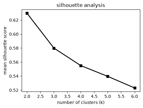
k=2: 0.630
k=3: 0.580
k=4: 0.555
k=5: 0.540
k=6: 0.523
Two clusters score highest — and two clusters is not three species. Both diagnostics are answering the question they were asked, which is how well-separated the groups in these two features are, not how many species the archipelago holds. A clustering that scores well can still be the wrong grouping for the question you care about.
Dimensionality reduction with PCA
PCA finds new axes — linear combinations of the original features — ordered by how much variance they capture, so a handful of components can summarise many correlated measurements. Scale first, exactly as for the pipeline above: PCA is sensitive to each feature’s variance, not just its values.
from sklearn.decomposition import PCA

features = ["bill_length_mm", "bill_depth_mm", "flipper_length_mm", "body_mass_g"]
Xs = StandardScaler().fit_transform(penguins[features])

pca = PCA(n_components=2).fit(Xs)
scores = pca.transform(Xs)
penguins["pc1"], penguins["pc2"] = scores[:, 0], scores[:, 1]
print("explained variance ratio:", pca.explained_variance_ratio_.round(3))

fig, ax = plt.subplots(figsize=(5.5, 4))
for species, group in penguins.groupby("species"):
    ax.scatter(group["pc1"], group["pc2"], s=15, label=species)
ax.set_xlabel(f"PC1 ({pca.explained_variance_ratio_[0]:.0%} of variance)")
ax.set_ylabel(f"PC2 ({pca.explained_variance_ratio_[1]:.0%} of variance)")
ax.set_title("penguin measurements, reduced to two components")
ax.legend(fontsize=8)
plt.show()
explained variance ratio: [0.688 0.193]
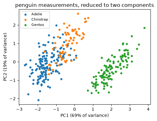
Unlike k-means, PCA needs no target and no assumed number of groups — here the first two components already separate the three species almost as cleanly as the full four-feature space, using all four correlated measurements at once instead of picking two by hand.
When generated code lies: scoring on the training data
Asked to “evaluate the model”, an assistant fits a flexible model and reports R^2 on the same data it trained on. On a small, noisy sample a high-degree polynomial fits almost perfectly — and predicts new points disastrously.
from sklearn.preprocessing import PolynomialFeatures

rng2 = np.random.default_rng(1)
x_small = np.linspace(0.2, 3.5, 20)
y_small = 15.0 - 6.5 * x_small + rng2.normal(0, 2.0, 20)   # noisy lapse rate, km
Xs = x_small.reshape(-1, 1)
Xs_tr, Xs_te, ys_tr, ys_te = train_test_split(Xs, y_small, test_size=0.4, random_state=0)

overfit = make_pipeline(PolynomialFeatures(degree=8), LinearRegression()).fit(Xs_tr, ys_tr)
print("degree-8 R^2 on TRAINING data:", round(r2_score(ys_tr, overfit.predict(Xs_tr)), 3))
degree-8 R^2 on TRAINING data: 0.971
linear = LinearRegression().fit(Xs_tr, ys_tr)
print("degree-8 R^2 on TEST data:", round(r2_score(ys_te, overfit.predict(Xs_te)), 1))
print("linear    R^2 on TEST data:", round(r2_score(ys_te, linear.predict(Xs_te)), 3))
degree-8 R^2 on TEST data: -7.1
linear R^2 on TEST data: 0.984
Solution
from sklearn.model_selection import train_test_split
from sklearn.linear_model import LinearRegression
from sklearn.metrics import r2_score
X = df[["elevation_m"]]; y = df["temp_celsius"]
Xtr, Xte, ytr, yte = train_test_split(X, y, test_size=0.3, random_state=0)
m = LinearRegression().fit(Xtr, ytr)
print(round(m.coef_[0] * 1000, 2), "°C km^-1")
print(round(r2_score(yte, m.predict(Xte)), 3))
Going deeper: cross-validation
A single split is noisy. k-fold cross-validation rotates the held-out fold and averages, giving a more stable estimate of generalisation.
from sklearn.model_selection import cross_val_score
scores = cross_val_score(LinearRegression(), X, y, cv=5, scoring="r2")
print(scores.mean(), scores.std())
Going deeper: beyond a linear decision boundary
LogisticRegression only draws a straight (or, with more features, flat) boundary. k-nearest neighbours and a decision tree follow the same interface but can bend around more complex class shapes.
from sklearn.neighbors import KNeighborsClassifier
from sklearn.tree import DecisionTreeClassifier

knn = KNeighborsClassifier(n_neighbors=5).fit(Xc_train, yc_train)
tree = DecisionTreeClassifier(max_depth=3).fit(Xc_train, yc_train)
Swapping one estimator for another only changes the one line that creates the model — the rest of the pipeline stays the same.
Going deeper: faceted histograms
sns.displot repeats one plot across the levels of a categorical column, so several distributions compare at a glance, on shared axes.
sns.displot(data=penguins, x="body_mass_g", col="species", bins=15, height=3)<seaborn.axisgrid.FacetGrid at 0x7fd842d273e0>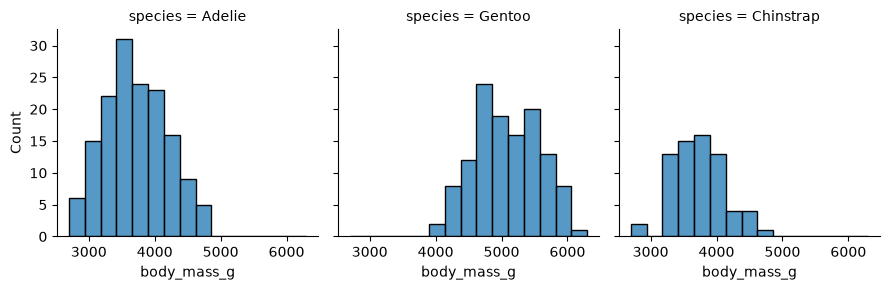
Going deeper: boxplots
A boxplot summarises a distribution’s median, quartiles, and outliers per category — more compact than a histogram when comparing several groups at once.
fig, ax = plt.subplots(figsize=(5, 3.5))
sns.boxplot(data=penguins, x="species", y="body_mass_g", ax=ax)
ax.set_ylabel("body mass (g)")
plt.show()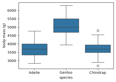
Going deeper: bar plots
sns.barplot aggregates a numeric column per category (the mean, by default) and draws the result with an error bar — a quick alternative to a manual groupby and hand-drawn bar chart.
fig, ax = plt.subplots(figsize=(5, 3.5))
sns.barplot(data=penguins, x="species", y="flipper_length_mm", ax=ax, errorbar="sd")
ax.set_ylabel("flipper length (mm)")
plt.show()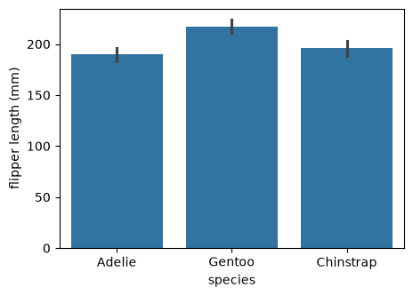
Going deeper: inferential regression with statsmodels
scikit-learn optimises prediction; statsmodels reports the inferential statistics — standard errors, confidence intervals, p-values — needed to reason about the lapse-rate estimate itself.
import statsmodels.api as sm
result = sm.OLS(y, sm.add_constant(X)).fit()
print(result.summary())      # coefficients with standard errors and CIs
Going deeper: bootstrap confidence intervals
Resampling the data with replacement and refitting many times gives an empirical distribution of any estimate — here the lapse rate — without distributional assumptions.
slopes = []
for _ in range(1000):
    idx = rng.integers(0, len(X), len(X))
    slopes.append(LinearRegression().fit(X.iloc[idx], y.iloc[idx]).coef_[0] * 1000)
low, high = np.percentile(slopes, [2.5, 97.5]) # 95% intervalSummary
| Concept | Rule to remember |
|---|---|
| Explore first | seaborn plots, describe, and corr reveal structure before any model is fitted. |
| Distributions | histplot/kdeplot show one variable (split it with hue=); jointplot adds the marginals to a 2D view. |
| Estimator interface | Every scikit-learn estimator is instantiate → fit(X, y) → predict. |
| Shapes | X is two-dimensional, y is one-dimensional. |
| Evaluating | Fit on the training set, score on a held-out test set; report RMSE in target units and R^2. |
| Overfitting | A high training score with a low test score; a training score alone is never performance. |
| Leakage | Put StandardScaler in a Pipeline so preprocessing is fitted on training data only. |
| Classification | LogisticRegression brings the same fit/predict interface to a categorical target. |
| Unsupervised | KMeans groups by proximity, PCA summarises by variance; the elbow and silhouette scores help choose k. |
Resources
scikit-learn — Getting started — the estimator interface, fit/predict, train/test evaluation, and pipelines.
seaborn — statistical visualisation on dataframes, including regression, correlation, and categorical plots (
displot,boxplot,barplot).scikit-learn — Clustering and Decomposing signals (PCA) — the k-means and PCA reference documentation, including choosing k.
palmerpenguins — Horst, Hill & Gorman (2020); the real dataset used for clustering and PCA above.