

Exercise 1: Explore
Build a DataFrame of 60 stations with elevation_m uniform on [200, 3500] and temp_celsius = 15 - 6.5 * elevation_m/1000 + noise (noise standard deviation 1.5 °C, seeded). Make a seaborn regression plot of temperature against elevation and print describe().
# Your solution hereExercise 2: Correlation
Print the Pearson correlation matrix of the DataFrame and identify the sign of the temperature–elevation correlation.
# Your solution hereExercise 3: Fit a linear regression
Fit LinearRegression with X = df[["elevation_m"]] and y = df["temp_celsius"]. Print the recovered lapse rate in °C km⁻¹ and the intercept.
# Your solution hereExercise 4: Honest evaluation
Split the data (test size 0.3, fixed random state), fit on the training set, and report the test RMSE and R^2.
# Your solution hereExercise 5: Multivariate regression on real advertising data
The data cached at path below (fetched by the pre-supplied cell) holds real advertising spend and sales for 200 markets: TV, Radio, and Newspaper budgets (thousands of dollars) and Sales (thousands of units) — the classic dataset behind the “which channel actually drives sales” question (James et al., An Introduction to Statistical Learning).
Load the CSV. Build
Xfrom all three budget columns andyfromSales.Split into train and test sets (test size 0.3, fixed random state), fit a
LinearRegression, and print the three coefficients alongside their column names.Report the test RMSE and R^2. Which budget has the largest coefficient? Before concluding that channel is the most effective, what would you need to check about the three columns’ scales?
# Pre-supplied: download the data file and cache it locally.
# You do not need to understand this cell yet — fetching data is covered in the
# reproducible-data-pipelines bonus subchapter.
import pooch

path = pooch.retrieve(
    url="https://raw.githubusercontent.com/gse-unil/2026_MLEES_book/main/data/part-I/Advertising.csv",
    known_hash="sha256:69104adc017e75d7019f61fe66ca2eb4ab014ee6f2a9b39b452943f209352010",
    fname="advertising.csv",
    path=pooch.os_cache("mlees"),
)
# Your solution hereExercise 6: A pipeline with scaling
Build a Pipeline of StandardScaler followed by LinearRegression, fit it on the training set, and print its test R^2 (via .score).
# Your solution hereExercise 7: Demonstrate overfitting
Fit a degree-8 polynomial pipeline and compare its R^2 on training data with its R^2 on test data. elevation_m is in metres (order 10^2-10^3); an 8th-degree polynomial built directly on raw metres is numerically unstable rather than overfit, so rescale it to kilometres first (divide by 1000) — the same rescaling the lecture’s own degree-8 demonstration relies on. Train on only the lowest 30% of the training set’s elevation range (Xtr_km["elevation_m"] < Xtr_km["elevation_m"].quantile(0.3)) and evaluate on the full test set from Exercise 4. The model never sees elevations above roughly the 30th percentile, so most test points require extrapolation — and a degree-8 polynomial’s error grows explosively outside the range it was fit on. Comment on the gap.
# Your solution hereExercise 8: Cross-validation
Use cross_val_score with 5 folds to estimate the R^2 of a plain LinearRegression on the full dataset, and print the mean and standard deviation across folds.
# Your solution hereExercise 9: Cluster and reduce the penguins data
Using the same palmer_penguins.csv data as the lecture (fetched by the pre-supplied cell below), drop rows with missing measurements, then:
Cluster the penguins into 2 groups with
KMeans, usingbill_length_mmandbill_depth_mm. Print a crosstab of true species against cluster to see how well 2 clusters separate 3 species.Reduce all four measurements (
bill_length_mm,bill_depth_mm,flipper_length_mm,body_mass_g) to 2 components withPCA, after scaling them. Print the explained variance ratio.
# Pre-supplied: download the data file and cache it locally.
# You do not need to understand this cell yet — fetching data is covered in the
# reproducible-data-pipelines bonus subchapter.
import pooch

penguins_path = pooch.retrieve(
    url="https://raw.githubusercontent.com/gse-unil/2026_MLEES_book/main/data/part-I/palmer_penguins.csv",
    known_hash="sha256:f204db2c753b0937caac3cb35258562c14f073e4bbc76be24b4c51ce22767a93",
    fname="palmer_penguins.csv",
    path=pooch.os_cache("mlees"),
)
# Your solution hereExercise 10: Forest fires, real data with seaborn
The data cached at path below (fetched by the pre-supplied cell) holds 517 real fire records from Montesinho natural park, Portugal (Cortez & Morais, 2007): each row is a fire with its month, weather conditions, and burned area.
Load the CSV. With
sns.boxplot, comparetemp(°C) acrossmonth.With
sns.barplot, compare meanwind(km/h) acrossmonth.area(hectares burned) is heavily right-skewed, with many zero-area records. Plot its histogram once on all records, and once after filtering out the zero-area rows with a boolean mask. Which plot actually shows the shape of the fires that did burn?
# Pre-supplied: download the data file and cache it locally.
# You do not need to understand this cell yet — fetching data is covered in the
# reproducible-data-pipelines bonus subchapter.
import pooch

path = pooch.retrieve(
    url="https://raw.githubusercontent.com/gse-unil/2026_MLEES_book/main/data/part-I/forest_fires.csv",
    known_hash="sha256:0d6586a1fa52f55bef48578aef14eb97273f1e9330e1a53423df497a77065253",
    fname="forest_fires.csv",
    path=pooch.os_cache("mlees"),
)
# Your solution hereExercise 11: Clustering the penguin data, at length
Exercise 9 clustered the penguins once, on the two bill measurements, and read the result off a crosstab. This is the long version of the same question, on a different pair of measurements — bill length against flipper length, beak against wing — and it asks the question Exercise 9 skipped: how many clusters should there have been?
Nothing here needs a new dataset. The fetch cell from Exercise 9 already put penguins_path in
scope; if you are running this notebook from the top, reuse it.
Q1) Clean the data. Drop every row with a missing measurement.
Call the result penguin_df and print its shape.
# Q1: drop the rows with missing measurementsQ2) Create an input array X from the bill_length_mm and flipper_length_mm columns.
Its shape should be (342, 2). Two columns, because the whole exercise is about being able to see
the answer on a flat plot.
# Q2: build X from bill_length_mm and flipper_length_mmQ3) Train k-means over a range of k, and choose k twice — once by the elbow method and once by silhouette analysis.
For k from 1 to 9, fit KMeans and record .inertia_, the sum of squared distances from each point
to its assigned centre. Plot inertia against k.
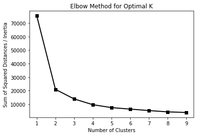
Figure 1:The elbow. Inertia always falls as k rises — with one cluster per point it reaches zero — so the number you want is not the minimum but the bend, past which each extra cluster buys much less.
Then, for k from 2 to 9, fit again and record silhouette_score(X, labels). Plot that against k
too. Unlike inertia, the silhouette score has a genuine maximum.
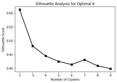
Figure 2:The silhouette score, which peaks rather than flattens.
In a comment, say which k each method points at, and whether they agree.
# Q3: the elbow plot, then the silhouette plotQ4) Cluster with k = 3 and compare the result against the true species.
Fit KMeans(n_clusters=3), predict the labels, and store them in penguin_df as a cluster
column. Then draw one scatter of bill length against flipper length in which the marker shape
carries the true species and the colour carries the predicted cluster — three
plt.scatter calls, one per species, each coloured by c=subset["cluster"].
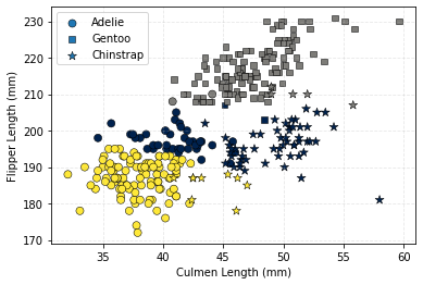
Figure 3:The figure to replicate. Where a marker shape and its colour agree everywhere, k-means found that species; where one shape carries two colours, it did not.
Hints: pass cmap="cividis" and fix the colour range with vmin=0, vmax=2 on all three calls, or
the three subsets will each be scaled separately and the colours will not mean the same thing.
Use s= to vary the marker size and label= for the legend.
In a comment: which species does k-means recover, and which two does it confuse?
# Q4: k = 3, then the scatter coloured by cluster and shaped by speciesQ5) Now cluster with k = 2 and draw the same figure.
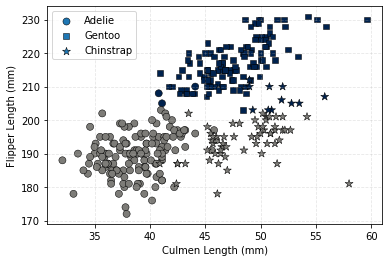
Figure 4:The same plot with k = 2, the value the silhouette score preferred.
The silhouette score preferred k = 2; the data has three species. In a comment, say what that disagreement means. It is not a bug in either method.
# Q5: k = 2, same figureExercise 12: Marathon data analysis
The last exercise of Part I is the one dataset in the book that is not environmental, and the only one where every row is a person. It is here because it exercises the half of seaborn that a scatter plot and a box plot do not reach: joint distributions, a grid of pairwise relationships, overlaid densities, and a violin plot split by a second variable.
The data is the finishing record of a marathon — roughly 37 000 runners, each with an age, a gender, a half-way split time and a final time. The question it answers is one you can check against your own intuition, which is what makes it a good last exercise: do people run the second half of a marathon faster or slower than the first?
Adapted from Jake VanderPlas, Python Data Science Handbook, whose marathon-data repository is the source of the file.
# Pre-supplied: download the data file and cache it locally, and parse the two time
# columns into timedeltas on the way in.
import datetime

import pooch

path = pooch.retrieve(
    url="https://raw.githubusercontent.com/gse-unil/2026_MLEES_book/main/data/part-I/marathon-data.csv",
    known_hash="sha256:0fff8a2bdf0cfb8887080c8132fed59399531fb836815c1935cc70823b940a85",
    fname="marathon-data.csv",
    path=pooch.os_cache("mlees"),
)

def convert_time(s):
    """Turn an 'hh:mm:ss' string into a timedelta."""
    hours, minutes, seconds = map(int, s.split(":"))
    return datetime.timedelta(hours=hours, minutes=minutes, seconds=seconds)

data = pd.read_csv(path, converters={"split": convert_time, "final": convert_time})
data.head()
Q1) Add two columns, split_sec and final_sec, holding the same two times in seconds.
A timedelta column is awkward to plot and awkward to divide. Convert both with
.dt.total_seconds(), then print the first few rows to check.
# Q1: add split_sec and final_sec, then check the first rowsQ2) Use sns.jointplot to plot final_sec against split_sec.
Use kind="hex" for the two-dimensional histogram, and add the line a runner of perfectly even
pace would lie on:
g.ax_joint.plot(np.linspace(4000, 16000), np.linspace(8000, 32000), ":k")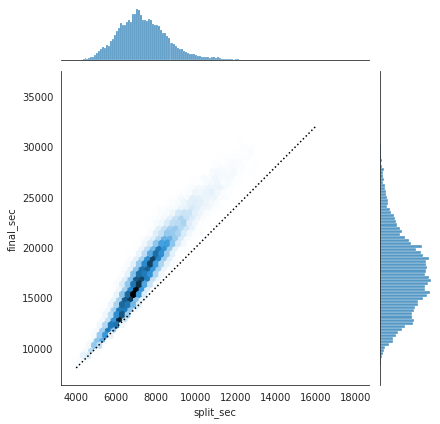
Figure 5:The figure to replicate. The dotted line is where a runner whose second half took exactly as long as the first would fall.
The distribution lies almost entirely above the line: most people slow down over the course of the race. Runners who do the opposite are said to have negative-split the race.
# Q2: the joint distribution, with the even-pace lineQ3) Add a split_frac column measuring how much each runner sped up or slowed down.
It is zero for an exactly even race, negative for a negative split, and positive for slowing down.
# Q3: add split_fracQ4) Print how many runners had a split_frac below zero.
You should get 251 — out of nearly 37 000.
# Q4: count the negative splitsQ5) Use sns.PairGrid to look for what split_frac correlates with.
Build the grid over age, split_sec, final_sec and split_frac, with hue="gender" so men and
women are drawn separately, and palette="RdBu_r". Map plt.scatter over it and add a legend.
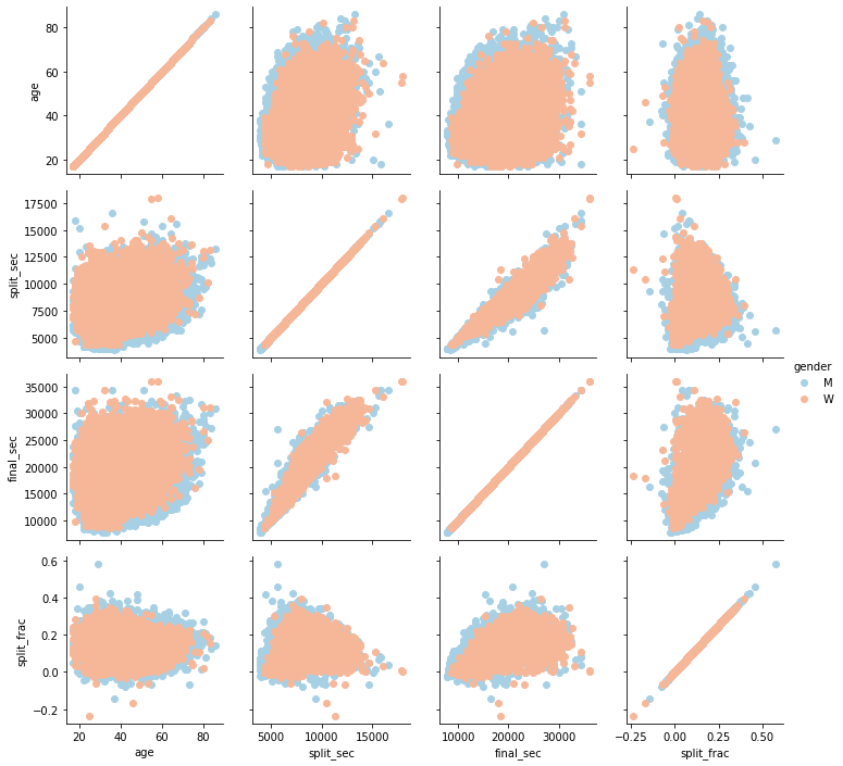
Figure 6:The figure to replicate.
In a comment, name the one pair in the grid that is a near-perfect straight line, and say why that particular relationship is not a finding about runners.
# Q5: the PairGridQ6) Compare the split-fraction distributions of men and women with sns.kdeplot.
One filled density per gender on the same axes, labelled, with a legend.
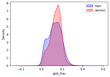
Figure 7:The figure to replicate.
Hint: seaborn renamed this argument — it is fill=True now, not shade=True.
# Q6: one filled density per genderQ7) Split the comparison by age as well, with sns.violinplot.
Add an age_decade column with 10 * (data["age"] // 10), then draw split_frac against
age_decade with hue="gender". split=True puts the two genders on either side of the same
violin, which is what makes them comparable decade by decade.
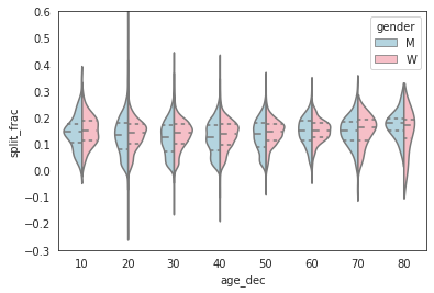
Figure 8:The figure to replicate.
In a comment: the violins for the oldest decades are much narrower than the rest. Before reading that as “older runners pace more consistently”, check how many runners are in those decades.
# Q7: add age_decade, then the split violins