

Exercise 1: A DataFrame and a column mean
Build a DataFrame with columns temp_celsius = [18.2, 17.5, 19.1, 16.8] and discharge_m3s = [48.0, 51.2, 47.5, 53.1]. Print the column dtypes and the mean temperature, rounded to two decimals.
# Your solution hereExercise 2: Write and read a CSV with dates
Build a DataFrame with a date column ("2024-06-01", "2024-06-02", "2024-06-03") and a temp_celsius column. Write it to _files/obs.csv without the index, then read it back with parse_dates=["date"] and print the dtypes.
# Your solution hereExercise 3: Label, position, and mask
Given
df = pd.DataFrame({"station": ["BAS", "LUG", "JFJ"], "temp_celsius": [18.0, 21.0, -1.0]},
                  index=["a", "b", "c"])
print the temperature at label "b", the whole first row by position, and all rows whose temperature is below 0 °C.
# Your solution hereExercise 4: Resample and rolling
Build a 40-day daily Series indexed by date (np.random.default_rng(0), mean 18, std 2). Print the monthly means and the first five values of the 3-day rolling mean, both rounded to two decimals.
# Your solution hereExercise 5: Group and aggregate
Given
df = pd.DataFrame({"station": ["BAS", "BAS", "LUG", "LUG"],
                   "temp_celsius": [18.0, 19.0, 21.0, 22.0]})
compute the mean temperature per station and print it as a dict.
# Your solution hereExercise 6: Handle a gap three ways
Given s = pd.Series([1.0, np.nan, np.nan, 4.0, 5.0]), print the forward-filled series, the linearly interpolated series, and the NaN-skipping mean. Note in a comment why the three differ.
# Your solution hereExercise 7: Join two tables
Given an observations table and a metadata table that share a station key, left-join the elevation onto the observations and print the result.
obs = pd.DataFrame({"station": ["BAS", "LUG"], "temp_celsius": [18.0, 21.0]})
meta = pd.DataFrame({"station": ["BAS", "LUG"], "elevation_m": [316, 273]})
# Your solution hereExercise 8: A log-scale axis, and counting past a threshold
River discharge is a classic right-skewed variable: most days sit near base flow, with a long tail of rare, much larger flood events.
rng = np.random.default_rng(1)
discharge_m3s = pd.Series(np.exp(rng.normal(3.4, 1.3, 300)))
Plot a histogram of
discharge_m3swith.plot(kind="hist"), on default (linear) axes, then again withlogy=True. Which view makes the long tail easier to read?Build a boolean mask for discharge above 100 m3 s-1 (a “flood” threshold), filter
discharge_m3swith it, and print how many of the 300 values exceed it.
# Your solution hereExercise 9: Filtered vs. unfiltered histogram
rng = np.random.default_rng(0)
temp_celsius = pd.Series(rng.normal(18.0, 2.0, 200))
temp_celsius[:5] = -999.0     # a stuck sensor: five obviously invalid readings
Plot a histogram of the raw
temp_celsiusvalues with.plot(kind="hist"). What does the stuck sensor do to the plot?Build a boolean mask that keeps only values above −50 °C, filter the Series with it, and plot the histogram again. In one comment, say which of the two plots you would trust.
# Your solution hereExercise 10: Earthquake data analysis
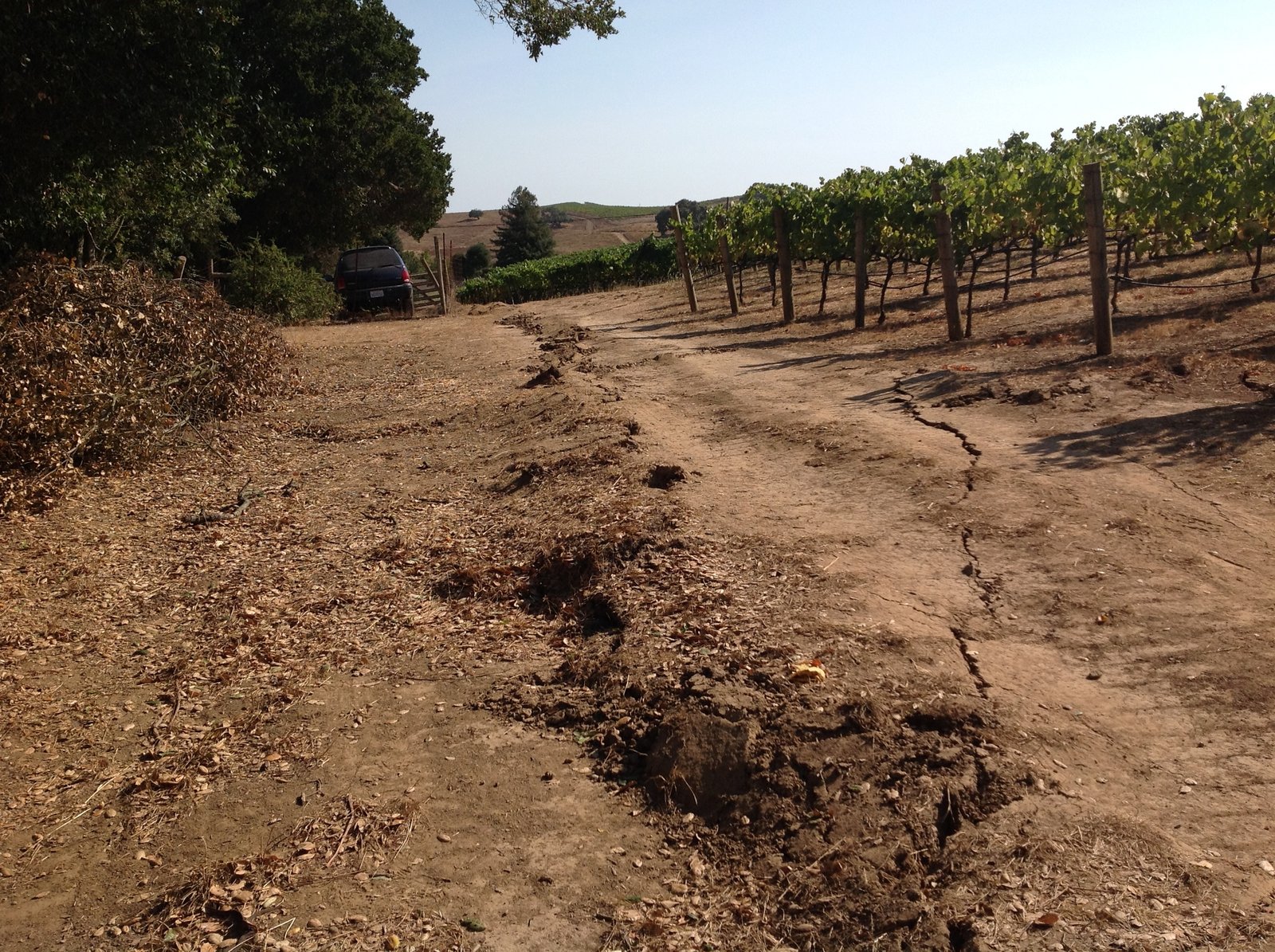
Figure 1:Surface rupture from the magnitude 6.0 South Napa earthquake of 24 August 2014 — the kind of event a row in this catalog stands for. The continuous “mole track” running parallel to the strike of the fault indicates some east–west compression on top of the right-lateral faulting; taken near Buhman Road. Photo USGS, public domain.
This exercise reviews the pandas fundamentals of this subchapter on one real catalog, covering how to
open csv files
manipulate dataframe indexes
parse date columns
examine basic dataframe statistics
manipulate text columns and extract values
plot dataframe contents using
bar charts
histograms
scatter plots
The data is a snapshot of the USGS Earthquakes Database: every event recorded worldwide in 2014, 120 108 rows.
You do not need to download the file yourself. The pre-supplied cell below fetches and caches it with the help of pooch — there is no need to read pooch’s documentation unless you want to — and stores the path to the file in the variable datafile.
# Pre-supplied: download and cache the earthquake data.
import pooch

datafile = pooch.retrieve(
    url="https://raw.githubusercontent.com/gse-unil/2026_MLEES_book/main/data/part-I/usgs_earthquakes_2014.csv",
    known_hash="sha256:84d455fb96dc8f782fba4b5fbe56cb8970cab678f07c766fcba1b1c4674de1b1",
    fname="usgs_earthquakes_2014.csv",
    path=pooch.os_cache("mlees"),
)Q1) First, import numpy, pandas and matplotlib, and — optionally — set the display options.
Hint: display options are documented at this link.
# Import all libraries hereQ2) Use pandas’ read_csv function directly on datafile to open it as a DataFrame.
Display the first few rows with .head(), and the column names, dtypes and non-null counts with
.info(). Check these tutorials if you have doubts about what the two functions do:
.head()
and
.info().
.info() will show you that the two date columns, time and updated, came in as plain strings
rather than as dates. They were not parsed automatically. What can you do about that?
# Open the file as a pandas DataFrame, then display the first few rows and the DataFrame infoQ3) Re-read the data in such a way that both date columns are identified as dates and the earthquake ID is used as the index.
Check with .head() and .info() that it worked: time and updated should now be
datetime64 columns, and id should be the index rather than a column.
Hint: the documentation for read_csv is here.
# Re-read the file, then check with head and info that it workedQ4) Use describe to get the basic statistics of all the columns.
Hint: the documentation of describe is at this link.
# Use the describe functionQ5) Use nlargest to get the top 20 earthquakes by magnitude.
Hint: the documentation of nlargest is at this link.
# Use nlargestQ6) Extract the state or country using pandas’ text data functions, and add it as a new column to the DataFrame.
Examine the column titled place: it holds strings like "26km S of Redoubt Volcano, Alaska", so
it carries both the local description and the state or country. Pull the second part out and store
it in a new column called country.
Hint 1: the documentation for pandas’ text data functions is here.
Hint 2: you will use .split() to extract the country names. The documentation of this function
can be found here.
# Extract the state or country, and add it as a new column to the DataFrame called countryQ7) Display each unique value from the new country column.
Hint: you may use the unique function documented at this link.
You should see an array of a couple of hundred country and state names. A plain split leaves the
space that followed the comma, so they come out as array([' Alaska', ' Nevada', ...]) — worth
removing before you use them as labels.
# Display unique valuesQ8) Create a filtered dataset that only has earthquakes larger than magnitude 4.
Hint: print the table to see the name of the column containing the earthquake magnitude.
Check out this link to find examples of filtering by column values.
# Filter the dataset based on the earthquakes' magnitudesQ9) Using the filtered dataset (magnitude > 4), count the number of earthquakes whose magnitudes are above 4 [Num 1], and count the number of earthquakes in each country or state [Num 2]. Make a bar chart of Num 2 for the top 5 locations with the most earthquakes.
Hint 1: to get Num 1, pandas has a count function documented
at this link.
Hint 2: check out the
value_counts
function to get Num 2.
Then convert the first five rows of Num 2 into a DataFrame with two columns, country (text)
and earthquake_num (number), and recreate the bar chart below.
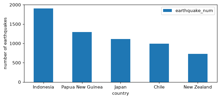
Figure 2:The five locations with the most magnitude-above-4 events in 2014.
# Count the >4 earthquakes, count them per country, then plot the top 5 as a bar chartQ10) Make a histogram for the distribution of the earthquakes’ magnitudes.
Hint: pandas has a histogram function documented at this link and matplotlib has one documented at this link.
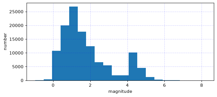
Figure 3:The distribution of magnitude across the whole catalog.
Then redraw it with a logarithmic scale on the y-axis, which brings the rare large events into view alongside the many small ones. Hint: here you can find a tutorial for how to change an axis scale.
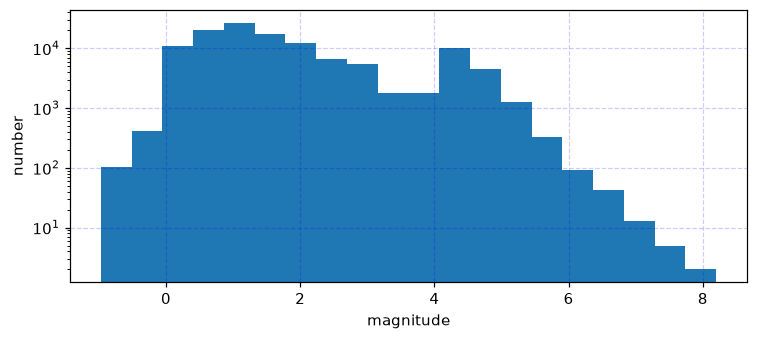
Figure 4:The same histogram with a logarithmic count axis.
Finally, make one histogram for the filtered dataset and one for the unfiltered dataset, side by side.
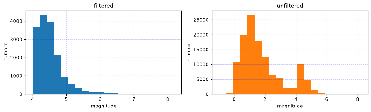
Figure 5:The filtered and unfiltered magnitude distributions, drawn on their own count axes.
# Make the three histogramsQ11) Visualize the locations of earthquakes by making a scatterplot of their latitude and longitude.
Make a figure with two panels: one for the filtered dataset and one for the unfiltered one, with the points coloured by magnitude on a shared colour range.
Hint: consider reading the documentation for
plt.scatter to make
the scatter plot and that of
plt.colorbar to
colour the points by magnitude.
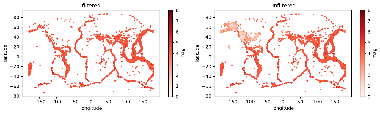
Figure 6:Every event in the catalog placed by longitude and latitude, filtered and unfiltered.
# Make the two scatter plotsDo you notice a difference between the filtered and unfiltered datasets?